The Storefront Signs Advantage: Making Your Mark in Central and Northern Utah
If you’ve ever driven down State Street in Orem or University Avenue in Provo and found yourself glancing at one business while completely ignoring the one right next to it, you’ve experienced exactly what storefront signs do — and what happens when they’re missing or poorly executed. Your storefront sign is the single most important visual asset your business owns at street level. It’s not a decoration. It’s a decision-making trigger. In the two or three seconds a driver or pedestrian has to notice your business, your sign either earns their attention or loses it entirely.
I’ve been involved in hundreds of storefront sign projects across Central and Northern Utah, and the pattern is always the same. Businesses with intentional, well-designed signage pull more foot traffic, generate stronger first impressions, and build brand recognition faster than competitors who treat their sign as an afterthought. It’s not opinion — it’s something I’ve watched happen over and over with our clients at Visibility Signs & Graphics.
Let me break down exactly why your storefront sign matters so much in this region and what separates signs that actually work from ones that just take up space on a building.
Your Storefront Sign Is Your Loudest Salesperson
Here’s a perspective shift that helps a lot of business owners I talk to: think of your storefront sign the same way you’d think of your best employee standing outside greeting every person who walks by. That sign is pitching your business thousands of times a day, seven days a week, without a break, without a bad day, without calling in sick. And it’s doing it silently in about two seconds per interaction.
That’s why design matters so much. A cluttered sign with too much text, low contrast, or a forgettable layout is like having a salesperson who mumbles. A clean, bold, well-lit sign with a clear brand identity is like having someone out front who makes everyone feel welcome and curious.
I worked with a boutique clothing shop in Vineyard that had been open for eight months with a temporary vinyl banner as their only signage. The owner told me foot traffic was painfully slow despite being in a brand-new retail development with solid vehicle counts. We designed and installed a set of illuminated channel letters with their logo and name in a modern script font, backlit with warm white LEDs. Within the first month, she said walk-in traffic roughly doubled. Nothing else changed — same location, same products, same hours. The only variable was the sign.
That’s not magic. That’s what happens when your storefront actually communicates “we’re open, we’re professional, and we’re worth your time.”
Also Read:
The Complete Guide to Sign Design, Installation & Repair in Utah
Channel Letters vs. Cabinet Signs vs. Dimensional Letters: Picking the Right Format
One of the most common questions I get from business owners is “what type of storefront sign should I get?” And honestly, the answer depends on your building, your brand personality, your budget, and the viewing conditions at your location.
Here’s a practical breakdown of the three most popular storefront sign formats we install across Central and Northern Utah:
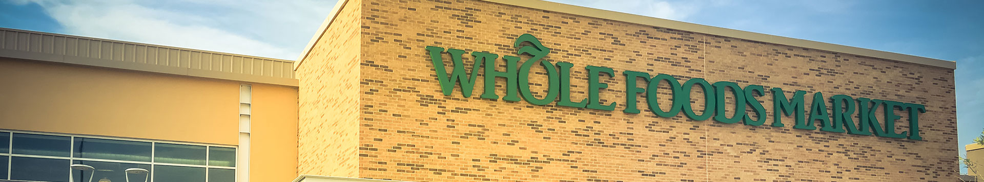
Channel letters are individually fabricated three-dimensional letters, typically aluminum with acrylic faces, internally lit with LEDs. They’re the most popular choice for commercial storefronts because they offer exceptional visibility day and night, they look professional across every industry, and they can be customized in virtually any font, color, and size. If your business faces a busy road or sits in a multi-tenant retail center, channel letters are probably your strongest option.
Dimensional letters are non-illuminated three-dimensional letters made from materials like acrylic, PVC, metal, or wood. They’re ideal for businesses that don’t need nighttime illumination or that want a more understated, high-end aesthetic. A law firm, boutique, or professional office that’s only open during business hours can get tremendous mileage from dimensional letters with a brushed metal or matte finish. They catch light and shadow naturally and add a sense of permanence and craftsmanship to your facade.
Cabinet signs — sometimes called lightbox signs — are a single enclosed unit with internal illumination. They’re common in strip malls and older commercial buildings. While they’re functional and affordable, they tend to look more generic than channel letters or dimensional letters. If you’re currently using a cabinet sign and it’s starting to look dated, upgrading to individual channel letters is one of the highest-impact changes you can make to your storefront.
At Visibility Signs & Graphics, we walk every client through these options during site evaluation. We look at your building material, available mounting surfaces, electrical access, local sign codes, and the typical speed and distance of passing traffic. All of those factors influence which format will actually perform best for your specific situation.
Illumination Changes Everything After Sunset
I can’t overstate this: if your storefront sign isn’t lit, you’re invisible to every potential customer who passes by after dark. And in Utah, that means you’re invisible by 5:30 PM for nearly half the year.
LED signs and LED-illuminated channel letters have become the standard for storefront signage precisely because they solve this problem so effectively. Modern LEDs are energy-efficient, incredibly long-lasting (we’re talking 50,000+ hours of operation), and available in a wide spectrum of color temperatures so you can match the warmth or coolness of your brand identity.
The type of illumination matters too. Front-lit channel letters push light through the acrylic face for maximum readability. Halo-lit (or reverse-lit) letters push light backward against the building wall, creating a sophisticated glow effect that works beautifully for upscale brands. Combination-lit letters do both — front illumination for readability plus a halo glow for depth and drama.
A med-spa in Provo we worked with chose halo-lit channel letters in a soft warm white against a dark gray facade. At night, it looks absolutely stunning — elegant, inviting, and impossible to miss from the road. Multiple patients have told the owner they found the practice specifically because they noticed the sign while driving past at night. That’s not a coincidence. That’s good signage engineering.
If you’re evaluating your current storefront and your sign goes dark at sunset, fixing that one issue alone could meaningfully change your traffic patterns.
Your Storefront Is More Than Just the Sign Above the Door
This is something I push every client to think about: your storefront isn’t just one sign. It’s a system of visual touchpoints that work together to attract, guide, and convert customers.
Window graphics are one of the most underutilized tools in the storefront toolkit. The glass across your storefront is prime real estate. Frosted vinyl adds privacy while incorporating your logo. Full-color printed graphics turn your windows into a street-level billboard. Perforated vinyl lets you display bold visuals from the outside while maintaining visibility from the inside. A coffee shop in Springville applied seasonal window graphics promoting their new fall menu — pumpkin lattes, apple cider, the works — and saw a noticeable spike in afternoon walk-ins within the first week.
Building signage beyond the primary storefront sign also matters. If your business sits on a corner, you have two facades to brand. If your building is visible from a highway or elevated road, the upper portion of the wall becomes a branding opportunity. We’ve designed secondary building signage for clients that doubled their visibility from directions their primary sign didn’t face.
Monument signs serve as the anchor for businesses set back from the road, especially in suburban commercial areas across Orem, Vineyard, and Lehi where setbacks can be significant. A monument sign near the road paired with a strong storefront sign on the building creates a two-stage visual funnel: the monument grabs attention from the road, and the storefront confirms the destination as customers pull into the lot.
The businesses that get the best results treat their entire exterior as a coordinated branding system — not a collection of individual signs ordered at different times from different vendors.
Also Read:
Complete Office Branding Guide: From Reception Signs to Washroom Icons & Window Graphics
Why Utah’s Climate Demands Professional-Grade Materials
If you’ve lived in Utah for any length of time, you know the weather doesn’t go easy on anything exposed to the elements. Summer temperatures pushing into triple digits with intense UV exposure. Winter stretches with freezing temps, snow loads, and ice. Spring windstorms that rip down anything not properly secured. And the drastic temperature swings between seasons that cause cheap materials to expand, contract, crack, and fade.
Your storefront sign has to survive all of that year after year while still looking like it was installed last week.
This is where the difference between professional-grade signage and budget alternatives becomes impossible to ignore. The channel letters we fabricate at Visibility Signs & Graphics use .063 aluminum returns, high-impact polycarbonate or acrylic faces, commercial-grade LED modules rated for extreme temperatures, and automotive-quality paint finishes. Our mounting hardware is engineered for wind load ratings appropriate to your specific location.
I’ve seen business owners try to save money with cut-rate signs from online vendors. Within two years — sometimes sooner — the faces yellow, the LEDs burn out unevenly, the paint peels, or the whole unit starts pulling away from the building. Then they end up paying twice: once for the cheap sign and once for the professional replacement that should have gone up in the first place.
Invest in quality from the start. Your sign is going to be on that building for five to ten years or more. Amortize the cost over that lifespan and it’s one of the most affordable marketing investments you’ll ever make.
The Interior Impression Should Match the Exterior Promise
Here’s a mistake I see often enough that it’s worth addressing: a business installs a fantastic storefront sign, drives new customers through the door, and then the interior experience doesn’t match the expectation the exterior created.
Your lobby signage is the interior handshake that confirms everything the storefront promised. When a customer walks in and sees a clean, branded reception area with a dimensional logo on the wall, consistent colors, and intentional design — that’s trust being built in real time. When they walk in and see a blank wall with a printed paper sign taped next to the front desk, that trust erodes immediately.
I always recommend that businesses think about the storefront-to-lobby journey as one continuous brand experience. The sign outside gets them through the door. The signage inside confirms they made the right choice. We’ve designed lobby signage packages that include dimensional wall logos, acrylic panel displays, and branded directional elements that carry the visual identity from the street right through to the back office.
A dental practice in Springville told us that after upgrading both their exterior channel letters and their interior lobby sign together, their patient satisfaction survey scores improved — specifically on questions about professionalism and trust. They didn’t change a single clinical procedure. They just changed how their space looked and felt.
Location-Specific Considerations Across Central and Northern Utah
Signage regulations vary by city, and Central and Northern Utah is a patchwork of different municipal codes. What’s permitted in Orem might have different size restrictions in Provo. Vineyard’s newer commercial developments have their own design standards. Springville has specific guidelines for their historic Main Street area.
At Visibility Signs & Graphics, we handle permitting and code compliance as part of every storefront sign project. We know the local ordinances across the cities we serve — from Provo and Orem up through Salt Lake City, Sandy, Lehi, and beyond — and we design within those parameters from the start so there are no surprises during the approval process.
This matters more than most people realize. I’ve had clients come to us after being denied a sign permit because their previous vendor designed something that violated local setback requirements or exceeded the allowed square footage. Starting over costs time and money. Starting with a team that knows the local codes saves both.
Also Read:
Custom Wraps Provo Utah Signage Solutions
Your Storefront Deserves to Work as Hard as You Do
You’ve poured your energy, savings, and passion into building your business. Your storefront sign should reflect that same level of commitment. It should look intentional. It should communicate quality. It should make people feel something positive before they ever step through your door.
In Central and Northern Utah’s growing and competitive business landscape, the difference between a storefront that attracts and one that gets overlooked often comes down to the sign. Not the product. Not the pricing. Not the location. The sign.
At Visibility Signs & Graphics, we take that responsibility seriously. We design, fabricate, and install storefront signs that are built to perform in Utah conditions, engineered to meet local codes, and crafted to reflect your brand at its best. Whether you’re opening your first location in Vineyard, refreshing a tired facade in Orem, upgrading from a lightbox to channel letters in Provo, or expanding into a second storefront in Springville — we’re here to make sure your sign earns its place on that building every single day.
Reach out to our team and let’s talk about what your storefront could be doing for your business. Because right now, every person driving past is forming an opinion. Let’s make sure it’s the right one.
Back