Top Trends in Commercial Building Signage for Businesses: Staying Ahead in the Signage Game

Let me tell you something I’ve learned after years of working alongside business owners on their signage projects — most people don’t think about their building sign until it’s already hurting them. They’ll renovate the interior, update the website, even redesign the logo, but the sign bolted to the building? It stays the same for a decade. And every single day, hundreds or thousands of people drive past it, forming an opinion about that business in under three seconds.
Your commercial building signage isn’t decoration. It’s the single most visible piece of marketing your business owns. It works around the clock, through every season, in every weather condition. And in 2026, the expectations around what a building sign should look like, how it should function, and what it should communicate have shifted dramatically.
I’ve been tracking these shifts closely through our work at Visibility Signs & Graphics, and the gap between businesses using modern signage strategies and those stuck with outdated signs is getting wider every month. If you haven’t revisited your signage approach recently, now’s the time.
Here’s what’s actually shaping commercial building signage right now — and how smart businesses are using these trends to pull ahead.
LED Technology Has Completely Raised the Bar
Five years ago, LED signs were a premium upgrade. Now they’re becoming the baseline expectation for any business that wants to be taken seriously after sundown. And that shift happened fast.
The reason is straightforward: LED signs deliver visibility that no other lighting method can match. They’re brighter, they consume significantly less energy than neon or fluorescent alternatives, and they last dramatically longer before needing replacement. I’ve worked with clients who were spending hundreds every year replacing burned-out neon tubes. After switching to LED, their maintenance dropped to practically zero.
But it goes beyond just slapping LED modules behind an existing sign face. The real trend in 2026 is integrated LED design — where the lighting isn’t an add-on, it’s a core part of the sign’s visual identity. Think halo-lit letters casting a soft glow against a dark facade. Think edge-lit acrylic panels that seem to float off the building wall. Think programmable color-changing LEDs that shift with seasons or promotions.
One of our clients, a medical clinic in the Sandy area, upgraded from a basic backlit box sign to individual halo-lit channel letters with warm white LEDs. The difference at night was staggering. Their building went from being nearly invisible after 6 PM to being the most noticeable business on the block. They told us new patients started mentioning they “finally noticed” the clinic after driving past it for years.
If your sign disappears when the sun goes down, you’re losing half your visibility window every single day. That’s a problem worth fixing.
Also Read:
Indoor vs Outdoor Signs: Choosing the Right Signage for Your Utah Business
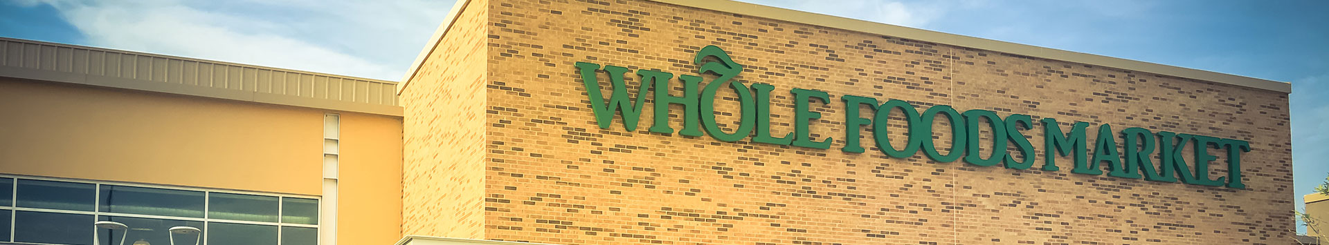
Channel Letters Are the Gold Standard for Exterior Identity
There’s a reason channel letters dominate commercial building facades from coast to coast — they simply work better than almost any other exterior sign type for brand recognition and readability.
Channel letters are individually fabricated three-dimensional letters, usually made from aluminum with acrylic faces, and internally illuminated with LEDs. They can be front-lit, back-lit (halo effect), or a combination of both. They’re clean, professional, and incredibly versatile across every industry.
What I’m seeing in 2026 is a move toward more creative channel letter applications. Businesses aren’t just spelling out their name in standard block fonts anymore. They’re incorporating their full logo in dimensional form, mixing materials like brushed metal returns with colored acrylic faces, and playing with letter depth and spacing to create unique visual signatures.
A fitness studio we worked with recently wanted something that felt bold and energetic. We fabricated oversized channel letters in a custom orange with exposed LED modules visible through a perforated face — an industrial look that matched their brand personality perfectly. It doesn’t look like any other gym sign in the area, and that’s exactly the point.
If your building still has a flat printed sign or a generic lightbox from the early 2010s, channel letters are probably the single biggest upgrade you can make to your exterior presence.
Monument Signs Are Getting a Modern Makeover
For decades, monument signs followed a pretty predictable formula: a brick or stone base, a cabinet insert with your business name, maybe a reader board for changeable messages. Functional? Sure. Memorable? Rarely.
That formula is getting torn up in 2026. The monument signs going up now use mixed materials — powder-coated aluminum, natural stone, weathered steel, concrete, backlit acrylic panels — combined in ways that make a genuine architectural statement. They’re not just identifying a business; they’re setting the tone before anyone even walks through the door.
I recently worked on a monument sign for a multi-tenant office complex in Lehi. Instead of the typical brick-and-cabinet approach, we designed a freestanding structure using dark charcoal aluminum with routed-out tenant names backlit in white LED. It looked like a piece of modern art, and every tenant in that building was thrilled to have their name on it.
The other big shift is size and placement strategy. Businesses are thinking more carefully about sightlines, traffic speed, and viewing distance. A beautiful sign that’s positioned too low, too far from the road, or at the wrong angle doesn’t serve anyone. We always do a site evaluation before designing a monument sign because placement matters just as much as design.
Wayfinding Is No Longer Just Arrows on a Wall
Here’s a trend that doesn’t get enough attention: wayfinding signage. Most people think of wayfinding as those little directional signs inside hospitals or airports, and they don’t give them much thought. But for any business with a complex layout — multi-building campuses, medical centers, large office buildings, retail plazas — wayfinding signs are absolutely critical to the customer experience.
Bad wayfinding frustrates people. They wander, they get lost, they feel anxious, and they associate that negative experience with your brand. Good wayfinding is invisible in the best way — people find exactly where they need to go without even thinking about it.
What’s changed in 2026 is the sophistication of wayfinding systems. We’re designing comprehensive wayfinding packages that start in the parking lot and carry through every corridor, elevator lobby, and floor. The visual language is consistent — same color coding, same iconography, same typography — so the experience feels seamless.
One healthcare client came to us after receiving repeated complaints about patients getting lost in their building. We mapped every pathway a visitor might take from the parking lot to every department and designed a color-coded wayfinding system with clear directional signage at every decision point. Complaints dropped almost immediately.
If people are regularly asking your front desk “where is…?” — that’s a wayfinding problem, and it’s costing you more than you realize in staff time and customer frustration.
Window Graphics Are Doing Double Duty
I’m a huge fan of window graphics because they solve two problems at once: they turn unused glass real estate into a branding and marketing surface, and they can provide practical benefits like privacy, UV protection, and glare reduction.
In 2026, the creative applications for window graphics have exploded. Frosted vinyl for conference room privacy that incorporates your logo. Full-color printed window wraps that turn a plain glass storefront into an eye-catching billboard. Perforated vinyl that displays bold graphics from the outside while maintaining visibility from the inside.
A co-working space we worked with in Orem had a ground-floor unit with floor-to-ceiling windows facing a busy street. They weren’t using that space at all — just bare glass. We designed a partial window wrap featuring their brand colors, a few key service highlights, and their website URL. It essentially turned their windows into a permanent advertisement that thousands of drivers see every day.
The cost-to-impact ratio on window graphics is outstanding. For a fraction of what a full exterior sign renovation would cost, you can dramatically change how your building looks from the street. And when it’s time to update, vinyl window graphics can be removed and replaced without any damage to the glass.
Wall Murals Are Turning Interiors Into Brand Experiences
This is one of the most exciting developments I’ve seen in commercial signage over the past few years. Businesses are realizing that their interior walls are massive branding opportunities — and wall murals are the tool to unlock them.
I’m not talking about hanging a framed mission statement in the lobby. I’m talking about full-wall, floor-to-ceiling graphics that tell your brand story, showcase your values, celebrate your team, or simply create an environment that people want to spend time in (and photograph for social media).
A tech company we worked with wanted their office to reflect their culture of innovation. We designed a series of wall murals across their hallways and common areas — a timeline of company milestones, an oversized typographic piece with their core values, and an abstract graphic in their brand colors that wrapped around a corner wall. Their recruiter told us candidates routinely comment on how impressive the office feels during interviews.
Wall murals work in virtually every setting: restaurants, retail stores, medical offices, corporate headquarters, gyms, hotels. The key is making sure the design is intentional and aligned with your brand — not just decorative filler.
The printing technology available now produces stunning results on textured walls, brick, drywall, and even concrete. And the materials are durable enough to hold up for years in high-traffic environments.
Also Read:
From Empty Walls to Fully Branded Store: Complete Signage Solutions for Retail Businesses in Utah
Vehicle Wraps Keep Extending Your Reach Beyond the Building
Your commercial building signage works hard, but it has one limitation — it stays in one place. Vehicle wraps solve that problem by taking your brand on the road, turning every delivery van, service truck, or company car into a mobile billboard.
The connection between building signage and vehicle wraps is something I always bring up with clients. When someone sees your wrapped vehicle on the highway and then later drives past your building and recognizes the same branding — that’s a one-two punch of recognition that builds trust fast.
What’s trending in 2026 is a move toward cleaner, more design-forward vehicle wraps. The days of cramming every service, phone number, email, and website onto a van are fading. The most effective wraps I see now feature bold graphics, a clear company name, a single call to action, and a website or phone number. That’s it. If someone’s reading your wrap in traffic, they have maybe two seconds. Make those seconds count.
We wrapped a fleet of service vans for an HVAC company, and within six months they were getting calls from people who said “I see your vans everywhere.” That kind of brand omnipresence is incredibly valuable, and it compounds over time as more people associate your vehicles with your building, your website, and your reputation.
What Separates Businesses That Stand Out From Those That Blend In
After working on hundreds of commercial building signage projects, the pattern is clear. The businesses that attract attention, earn trust on sight, and convert foot traffic into paying customers are the ones that treat their signage as a strategic investment — not an afterthought.
They think about how their sign looks at night, not just during the day. They consider the full customer journey from the parking lot through the front door. They keep their branding consistent whether someone sees their building, their vehicle, their lobby, or their window. They work with a signage partner that understands fabrication, design, installation, and maintenance — not just one piece of the puzzle.
At Visibility Signs & Graphics, that’s exactly how we approach every project. We’re not just making signs. We’re building visibility systems that work together to grow your business every single day.
If your current signage isn’t pulling its weight — or if you’re opening a new location and want to get it right from day one — reach out to our team. We’ll walk your site, understand your goals, and put together a signage plan that actually delivers results. Your building is talking to every person who passes by. Make sure it’s saying the right thing.
Back