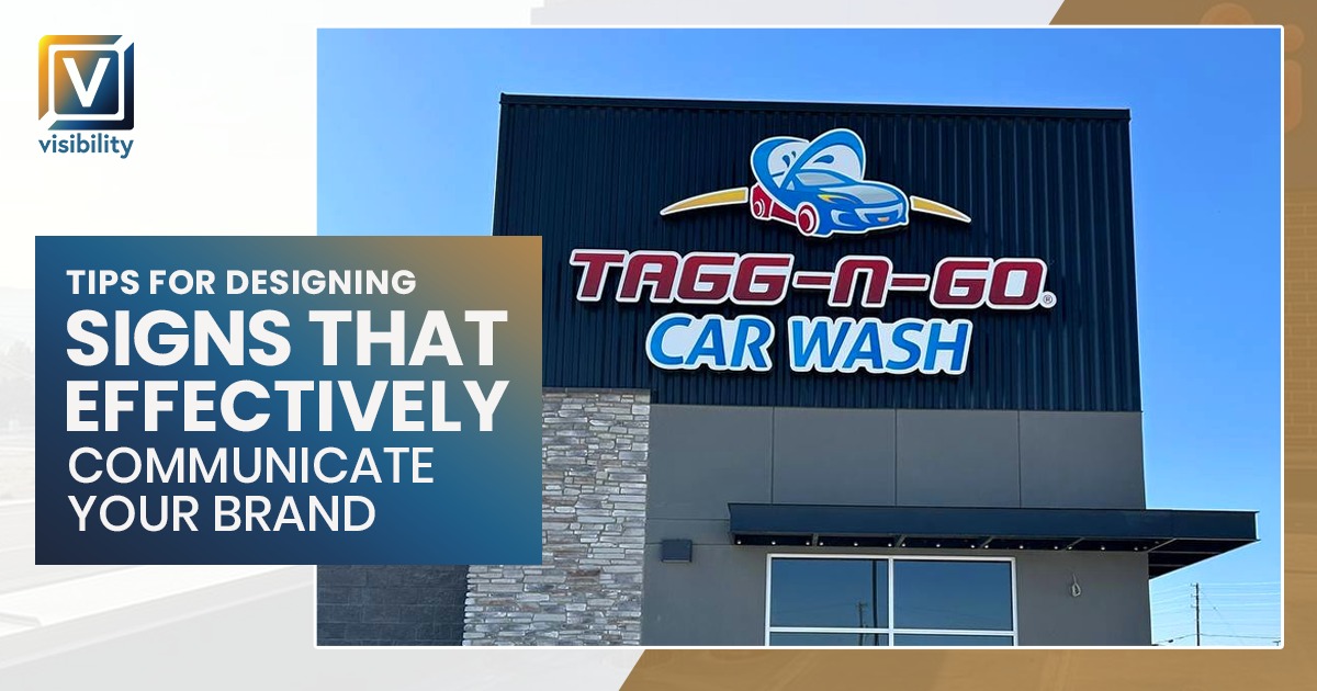
Expert Tips for Designing Signs That Effectively Communicate Your Brand

When it comes to building a brand, every touchpoint counts, especially the signage. Your business signs, whether they’re at your storefront, inside your office, or guiding visitors through a conference, are some of the most visible ways your brand communicates with the world. A well-designed sign does more than provide information; it conveys your brand’s personality, values, and professionalism. At Visibility Sign, we understand the importance of crafting signs that resonate with your target audience while aligning with your broader brand strategy.
Define Your Brand Identity
Before diving into sign design, it’s essential to define your brand identity. Your signage should be an extension of your business’s core values, visual style, and tone of voice. Is your brand luxurious, approachable, or innovative? This identity will shape every design decision, from color choices to the font you select.
Key Considerations:
- Brand Values: Your sign should embody your company’s values. For example, a company like Tesla might opt for sleek, modern designs to emphasize innovation and sustainability. At the same time, Lush Cosmetics might incorporate earthy tones and handmade elements to reflect their eco-conscious ethos.
- Target Audience: Consider your ideal customers’ expectations. A tech startup might go for a bold, futuristic look, whereas a family-owned bakery might choose a warm, welcoming design.
By aligning your signage with your brand’s core values, you’ll create a strong, cohesive visual identity that resonates with your audience.
Prioritize Clarity and Readability
A sign’s primary purpose is communication. A stunning sign design is meaningless if people can’t scan it. This is particularly important in high-traffic areas or where people will only glance at your sign for a few seconds.
Clear and Readable Text:
- Fonts: Choose fonts that are legible from a distance. Avoid intricate or overly stylized fonts that may hinder readability. Consider the practicality of your font, especially when designing outdoor signs. Brands like Nike and Apple are excellent examples of how simplicity in typography can elevate a sign’s impact.
- Text Size: Ensure that your business name and key message are large enough to be seen from afar. The general rule is that for every 10 feet of distance, the text should be at least one inch in height.
Clarity and legibility are fundamental aspects of design that cannot be overlooked. After all, if your audience can’t read your sign, your branding efforts are wasted.
Opt for the Right Materials
The materials you choose for your sign play a significant role in both the durability and aesthetic appeal of the final product. A high-quality, well-chosen material reflects positively on your brand and can help convey a sense of professionalism.
Outdoor vs. Indoor Materials:
- For Outdoor Signs: Choose weather-resistant materials like aluminum, acrylic, or PVC. These materials are durable and can withstand elements like rain, wind, and direct sunlight. For example, a Starbucks outdoor sign uses high-quality acrylic that reflects its polished, global brand.
- For Indoor Signs: You might choose materials like wood, foam board, or fabric, depending on the ambiance you’re aiming for. A high-end restaurant might use wood for a classic, rustic feel, while a modern boutique may prefer sleek foam board or acrylic signs to match its contemporary style.
Material Choice for Impact:
Consider adding texture or dimension. For example, using raised lettering or illuminated signs, like those seen at Times Square, can make your signage stand out and attract attention even at night.
Keep the Focus on Your Logo
Your logo is the cornerstone of your branding. It’s the symbol that represents your business and helps customers instantly recognize your company. When designing your sign, make sure your logo is the focal point.
Logo Placement:
- For large signs, consider placing your logo at the center or top to grab attention immediately.
- Ensure your logo is large enough to be easily identifiable, but balanced with other design elements such as your tagline or contact information.
A business like Coca-Cola uses its iconic logo to anchor its signage, allowing customers to associate the sign with the brand immediately. Your sign should do the same.
Consistency Is Key Across All Signs
Consistency across your signage reinforces your brand’s identity. Whether you’re creating a sign for your storefront, wayfinding signs, or a trade show booth, it’s essential to maintain a unified design approach that aligns with your company’s visual language.
Applying Consistency:
- Color Palette: Use your established brand colors across all signage, both online and offline. This ensures your branding is cohesive no matter where your audience encounters it.
- Typography: Stick to one or two fonts from your established brand guidelines. Using too many fonts can make your signage look cluttered and inconsistent.
Global brands like McDonald’s maintain this consistency across their signs worldwide, ensuring customers instantly recognize the brand wherever they are. This consistency builds brand loyalty and recognition over time.
Consider Sign Placement and Visibility
The placement of your signs is just as important as their design. A sign that’s poorly placed or challenging to read can easily be overlooked. To maximize the effectiveness of your signage, carefully consider its placement.
Key Placement Tips:
- Visibility: Make sure your sign is positioned where it will be noticed, whether that’s by a busy street or inside a building’s main entrance.
- Height and Angle: Ensure the sign is placed at an optimal height for viewing. This may vary depending on your business’s location. For example, a sign outside a bank might need to be higher up to be visible to drivers, while a sign inside a gym can be at eye level.
Directional signs, such as those in a shopping mall or corporate office, should be strategically positioned to guide people effortlessly through your space, much like the signs in shopping malls that use consistent iconography and typography to lead customers to stores or facilities.
Make Your Sign Accessible
Accessibility is an essential aspect of modern design, ensuring your sign is usable by everyone, including people with disabilities.
Accessible Signage:
- ADA Compliance: Signs should comply with the Americans with Disabilities Act (ADA), including tactile (Braille) signage, good contrast between text and background, and clear, simple fonts.
- Multilingual Signs: If your business serves a diverse population, consider adding multilingual elements to your signage. This can make your business more inclusive and help you reach a broader customer base. For instance, a restaurant in a multicultural neighborhood might feature menus or signs in multiple languages.
Being inclusive in your signage design not only reflects well on your brand but also helps ensure that all customers can interact with your business seamlessly.
Incorporate a Strong Call to Action (CTA)
Adequate signage often includes a clear call to action (CTA), especially if your goal is to drive a specific behavior such as visiting your website, entering your store, or making a purchase.
Effective CTAs
- Use actionable language, such as “Visit us today” or “Sign up for exclusive offers.”
- Make sure the CTA stands out visually by using a contrasting color or a bold font.
IKEA, for example, often incorporates CTAs such as “Browse our latest collection” or “Join our loyalty program” in its signage, prompting customers to take the next step in their shopping experience.
Keep the Design Clean and Simple
While it’s tempting to add intricate details or overly complex graphics, simplicity is often the most effective design choice. A clean, straightforward sign ensures your message is clear and easy to digest.
Emphasize Visual Hierarchy:
A clean design allows for an intuitive visual hierarchy, where the most important elements—like your brand name—are the first things people notice. Companies like Apple and Nike are masters of this approach, using minimalist designs that make their logos and key messages the focal points.
Test and Refine Your Design
Before finalizing your sign, it’s essential to test the design. This could mean getting feedback from employees or even running a small focus group. Testing ensures that your sign communicates what you intend and resonates with your audience.
Key Testing Areas:
- Does the sign stand out in its environment?
- Is the text legible and easy to read from a distance?
- Does the sign accurately reflect your brand identity?
Companies like Target often test their signage with focus groups to ensure their designs appeal to their target market and align with their broader marketing strategy.
Conclusion
Designing signs that effectively communicate your brand is a multifaceted process that requires a deep understanding of your brand identity, your audience, and the context in which your signs will be placed. By following these expert tips, from prioritizing clarity and consistency to choosing the right materials and ensuring accessibility, you can create signage that not only informs but also engages and resonates with your audience.
At Visibility Sign, we specialize in helping businesses design and produce high-quality signs that reflect their unique brand identity. Whether you need a storefront sign or an interior display, our team is here to help bring your vision to life.
Back


