
Why Your Restaurant Doesn’t Feel Premium (And How Signs, Lighting & Wall Graphics Can Fix It)
Many restaurant owners believe that good food alone is enough to create a premium dining experience. While food quality is essential, it is not the only factor that shapes how customers perceive your restaurant. In reality, the feeling of “premium” comes from a combination of visual branding, ambience, lighting, signage, and interior storytelling.
If your restaurant is struggling with low customer retention, weak brand identity, or customers describing the experience as “average” despite good food, the problem is often not your menu. It is your environment.
This article explains why your restaurant doesn’t feel premium and how strategic use of signs, lighting, and wall graphics can completely transform customer perception without expensive renovations.
First Impression Problem: Customers Decide in Seconds
When a customer walks into your restaurant, they form an opinion within seconds. This judgment is not based on taste, but on what they see, feel, and experience visually.
If the entrance looks plain, signage is unclear, or lighting feels dull, customers subconsciously assume the restaurant is not high-end, even before sitting down.
Common first impression issues include:
- Poor or outdated exterior signage
- Dim or overly harsh lighting
- Empty or unbranded walls
- Confusing layout without clear direction signs
- Lack of visual identity or theme
Even a well-designed menu cannot fix a weak first impression.
Also Read:
Why Your Store Isn’t Attracting Customers (And How Outdoor & Indoor Signs Can Fix It Fast)
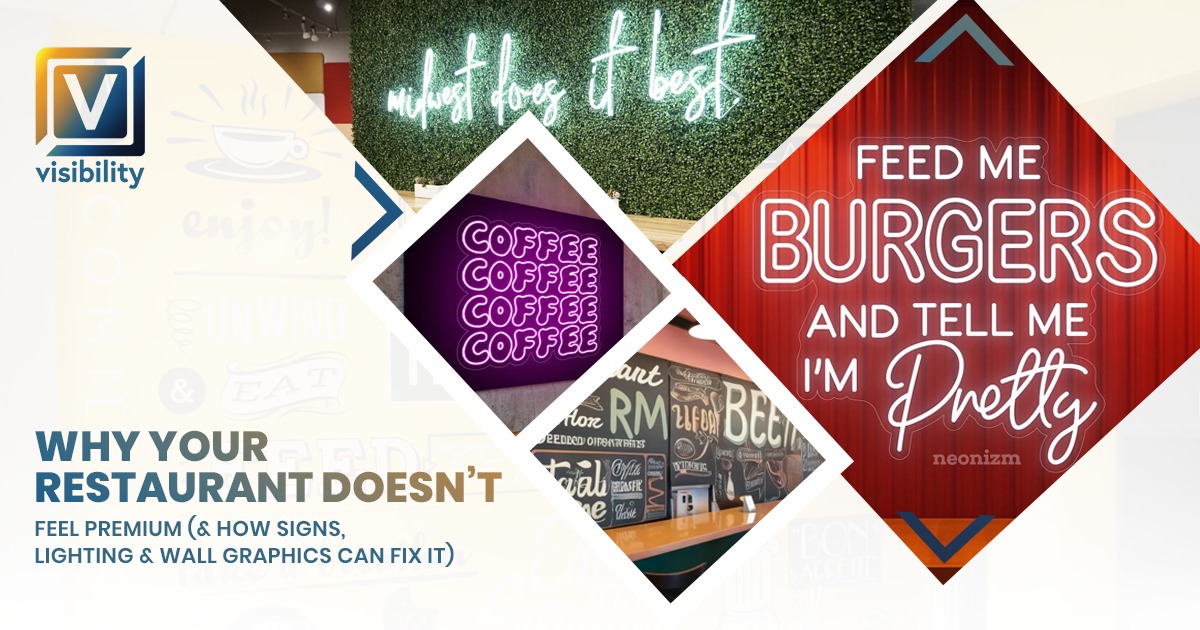
Problem 1: Weak or Generic Signage
Signage is one of the most powerful branding tools in a restaurant, yet it is often ignored.
If your signage is:
- Faded or low-quality
- Poorly lit or not visible at night
- Generic without brand personality
- Misaligned with your interior design
Then your restaurant automatically loses its premium feel.
Premium restaurants use signage as a brand statement, not just identification.
How signage impacts perception:
- Clean, well-lit signage signals professionalism
- Custom typography creates brand identity
- High-quality materials suggest high-quality food
- Dim or broken signage suggests neglect
A restaurant without strong signage feels temporary, even if it has been there for years.
Problem 2: Poor Lighting Ruins Ambiance
Lighting is one of the most underestimated elements in restaurant design. It can make a space feel luxurious or cheap instantly.
Bad lighting examples:
- Too bright white lighting that feels like a cafeteria
- Too dim lighting that reduces visibility
- Uneven lighting with dark corners
- No highlight lighting for décor or branding
Premium restaurants use layered lighting strategies:
- Ambient lighting for overall mood
- Accent lighting for walls and branding
- Task lighting for dining areas
- Decorative lighting for emotional impact
Lighting affects how food looks, how customers feel, and how long they stay.
For example:
Warm lighting makes food look more appealing and creates comfort, while cold lighting can make even high-quality interiors feel uninviting.
Problem 3: Empty or Unbranded Walls
Walls are one of the biggest missed opportunities in restaurant design.
Many restaurants leave walls:
- Blank and white
- Randomly decorated
- Inconsistent with brand identity
This creates a disconnected and unfinished look.
Premium restaurants use wall space as storytelling tools.
Why wall design matters:
- It reinforces brand identity
- It creates Instagram-worthy moments
- It improves customer engagement
- It fills visual emptiness
Without wall graphics or décor, even expensive furniture can look out of place.
How Signs, Lighting & Wall Graphics Fix the Premium Feel
Now, let’s understand how you can fix these issues without rebuilding your entire restaurant.
1. Use Strategic Signage to Build Identity
Instead of basic signage, focus on custom branding elements.
Effective signage solutions include:
- Illuminated exterior signs for visibility
- Reception or entry feature signs
- Menu boards with modern design
- Directional signage for better flow
- Branded wall-mounted logos
A well-designed sign is not just functional; it is emotional branding.
For example:
A glowing, well-designed logo at the entrance immediately signals quality and professionalism.
2. Upgrade Lighting for Mood and Emotion
Lighting redesign does not require a major renovation. Small adjustments can completely change the atmosphere.
Simple improvements include:
- Installing warm LED lighting instead of harsh white lights
- Adding pendant lights above tables
- Using spotlighting on key branding areas
- Highlighting wall art or logo features
Restaurants that feel premium usually have controlled lighting zones instead of one flat brightness level.
Lighting should guide attention, not just illuminate space.
3. Use Wall Graphics to Tell a Story
Wall graphics are one of the most cost-effective ways to upgrade restaurant interiors.
You can use:
- Brand storytelling murals
- Food-themed artwork
- Cultural or heritage visuals
- Typography-based quotes
- Texture-based designs like brick or wood effects
Wall graphics create an emotional connection.
For example:
A café with coffee-themed wall art feels more authentic and immersive than plain painted walls.
Also Read:
Shop Renovation Guide in Utah: From Flex Printing to Window Graphics
4. Create a Visual Flow Inside the Restaurant
Premium restaurants guide customers visually from the entrance to seating.
You can achieve this through:
- Directional signage
- Lighting pathways
- Consistent wall themes
- Brand color consistency
When a space feels organized and intentional, it automatically feels more premium.
5. Consistency is the Real Luxury Factor
Many restaurants try to improve their appearance by adding random décor pieces. However, true premium feel comes from consistency.
Ask these questions:
- Do my signs match my interior theme?
- Is my lighting consistent across all areas?
- Do my walls tell the same brand story?
If the answer is no, the space will always feel slightly “off,” even if individual elements are good.
Common Mistakes That Make Restaurants Feel Cheap
Here are some common mistakes that reduce perceived value:
- Mixing too many design styles
- Using cheap printed signage
- Overcrowding walls with unrelated décor
- Poor maintenance of lighting fixtures
- Ignoring exterior appearance
Even small inconsistencies can lower customer trust.
Why Design Matters More Than Budget
A common misconception is that premium restaurants require large budgets. In reality, design strategy matters more than spending.
A well-planned small restaurant with:
- Strong signage
- Warm lighting
- Branded wall graphics
Can feel more premium than a larger restaurant with no design direction.
Psychological Impact on Customers
Customers do not consciously analyze design elements, but they feel them.
Good design leads to:
- Higher trust
- Longer dining time
- Increased spending
- Better reviews
Poor design leads to:
- Quick exits
- Price sensitivity
- Low perceived value
This is why ambiance directly affects revenue.
Also Read:
From Empty Walls to Fully Branded Store: Complete Signage Solutions for Retail Businesses in Utah
Final Thoughts
If your restaurant doesn’t feel premium, the issue is rarely just food quality. It is almost always a visual experience.
Signs, lighting, and wall graphics work together to create perception. When these elements are aligned, even a simple restaurant can feel high-end, memorable, and emotionally engaging.
You do not need a full renovation. You need intentional design.
Focus on:
- Strong, branded signage
- Layered and warm lighting
- Story-driven wall graphics
- Consistent visual identity
Once these elements come together, your restaurant stops feeling ordinary and starts feeling premium.
Back