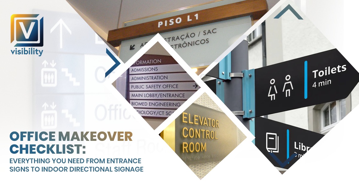
Office Makeover Checklist: Everything You Need From Entrance Signs to Indoor Directional Signage
An office makeover doesn’t always require construction, heavy renovation, or a large budget.
In many cases, the real problem is not the space—it’s how the space is presented.
Your office might already have the right layout, good lighting, and functional design. But without proper signage, branding, and visual structure, it can still feel incomplete, confusing, or unprofessional.
That’s why a smart office makeover focuses on clarity, consistency, and communication—not just physical changes.
This checklist will guide you step by step, covering everything from entrance signage to indoor directional systems, so your office becomes a well-structured, branded, and professional environment.
Why You Need a Structured Office Makeover Checklist
Many businesses upgrade their office randomly—adding a sign here, a graphic there—without a clear plan.
The result is often:
- Mismatched design elements
- Confusing navigation
- Weak brand identity
- Wasted budget
A checklist ensures that every element works together as a system.
What a Proper Checklist Helps You Achieve:
- Clear planning and execution
- Consistent branding across all areas
- Better use of space
- Improved visitor experience
Instead of guessing, you follow a strategic approach that delivers real results.
1. Entrance Signage – Your First Impression Starts Outside
Your entrance is the first interaction people have with your business—even before they walk in.
If your entrance is unclear or poorly branded, it immediately weakens your credibility.
What Entrance Signage Includes:
- Building name signs
- Office suite identifiers
- Door branding or decals
- Exterior logo displays
Why It Matters:
A strong entrance sign:
- Makes your office easy to locate
- Builds trust before interaction
- Communicates professionalism instantly
Without it:
- Visitors may feel confused
- Your business may appear less established
Best Practices:
- Use bold, readable fonts
- Ensure visibility from a distance
- Use weather-resistant materials
- Keep design aligned with your brand
Your entrance is not just a sign—it’s your first brand statement.
Also Read:
Planning an Office Renovation? Here’s How to Handle Glass Branding, Wall Graphics & Signage Together
2. Reception Area Branding – Setting the Tone Inside
Once visitors enter, your reception area takes over the experience.
This space should clearly represent your brand and create a strong first impression.
Key Elements to Include:
- Logo signage (acrylic, 3D, or LED)
- Feature wall behind reception
- Clean and minimal desk setup
- Proper lighting for visibility
Why It Matters:
Reception is where visitors:
- Wait and observe
- Form first impressions
- Decide how professional your business feels
What a Strong Reception Delivers:
- A welcoming environment
- Immediate brand recognition
- Increased client confidence
A well-branded reception turns your office into a professional experience from the first step.
3. Indoor Directional Signage – Making Navigation Effortless
After the reception, visitors should be able to move around your office without confusion.
Directional signage plays a key role in this.
What to Include:
- Arrows and wayfinding signs
- Floor directories
- Department labels
- Meeting room indicators
Why It Matters:
Without directional signage:
- Visitors feel lost or uncomfortable
- Employees get interrupted frequently
- The office feels unorganized
With it:
- Movement becomes smooth and intuitive
- The office feels structured
- User experience improves significantly
Placement Tips:
- At hallway intersections
- Near entrances of departments
- Outside meeting rooms
Good signage works like a silent guide, improving flow without effort.
4. Door Plates & Room Identification – Adding Structure
Door plates are small details—but they make a big difference.
They define spaces and bring clarity to your office layout.
What to Include:
- Employee nameplates
- Department labels
- Meeting room names
Why It Matters:
Without door plates:
- Spaces feel undefined
- Visitors get confused
- The office looks inconsistent
Best Practices:
- Maintain consistent design across all plates
- Use durable materials (acrylic, metal, etc.)
- Ensure text is easy to read from a distance
Door plates add precision, clarity, and professionalism.
5. Wall Branding & Graphics – Turning Walls into Brand Assets
Walls are one of the largest visual elements in your office.
Leaving them empty is a missed opportunity.
What Wall Branding Includes:
- Logo feature walls
- Brand story visuals
- Mission and vision displays
- Motivational quotes
Why It Matters:
Without wall graphics:
- The office feels empty
- Branding is not visible
- The environment lacks energy
With wall graphics:
- The space feels alive and engaging
- Your brand becomes visible everywhere
- Visitors remember your office
Strategy Tip:
Focus on key areas:
- Reception
- Hallways
- Workspaces
Wall graphics turn your office into a visual storytelling environment.
Also Read:
From Empty Space to Strong Brand: How Complete Signage Transforms Utah Retail Stores
6. Glass Graphics & Stickers – Smart Use of Glass Spaces
Modern offices use glass extensively—but often leave it plain.
Glass graphics help you use these surfaces effectively.
What to Include:
- Frosted vinyl for privacy
- Logo decals
- Decorative patterns
Why It Matters:
Glass graphics:
- Add privacy without blocking light
- Improve aesthetics
- Enhance branding consistency
Where to Use Them:
- Meeting rooms
- Office cabins
- Entry doors
Glass graphics create a balance between openness and professionalism.
7. Compliance & Utility Signage – Small Details That Matter
These signs are often ignored—but they are essential for usability.
What to Include:
- Washroom signs
- Accessibility signage
- Emergency exit signs
- Safety instructions
Why It Matters:
- Helps visitors navigate easily
- Ensures compliance with standards
- Reflects attention to detail
Small elements complete the overall branding system.
8. Consistency Across All Elements – The Real Game Changer
Even the best elements fail if they don’t match.
Consistency is what connects everything.
What Needs to Be Consistent:
- Colors
- Fonts
- Materials
- Design style
Why It Matters:
With consistency:
- Your office feels intentional
- Branding becomes stronger
- Trust increases
Without it:
- The space feels disconnected
- Branding looks weak
Consistency is the difference between a designed office and a branded office.
9. Lighting & Visibility – Making Everything Noticeable
Design alone is not enough—visibility matters.
What to Check:
- Proper lighting on signage
- No shadows or glare
- Visibility from key angles
Why It Matters:
- Improves readability
- Enhances visual impact
- Makes branding more noticeable
Good lighting ensures your design actually gets seen and appreciated.
10. Material Quality – Protecting Your Investment
Low-quality materials can ruin even the best design.
Recommended Options:
- Acrylic signage
- Metal finishes
- High-quality vinyl
- UV-resistant prints
Why It Matters:
- Longer lifespan
- Better appearance
- Reduced maintenance
Quality materials ensure your office looks professional long-term, not just initially.
Also Read:
From Empty Walls to Fully Branded Store: Complete Signage Solutions for Retail Businesses in Utah
11. Phased Implementation – Smart Way to Upgrade
You don’t need to do everything at once.
Suggested Order:
- Entrance signage
- Reception branding
- Directional signage
- Wall graphics
- Glass branding
Why It Works:
- Reduces budget pressure
- Minimizes disruption
- Allows gradual improvement
A phased approach makes your makeover manageable and efficient.
Final Thought
An office makeover is not about changing everything—it’s about improving what already exists.
When you focus on signage, branding, and visual structure, your office becomes:
- Easy to navigate
- Visually appealing
- Professionally organized
- Memorable
And most importantly, it becomes a true reflection of your brand.
Because in today’s business world, your office is not just a workspace—it’s your silent marketing tool.
Back