The Signage Evolution: How Modern Building Signs Are Revolutionizing Business Impact
There’s a building on State Street in Orem that I drive past almost every day. For years, it had a faded cabinet sign with a backlight that flickered more than it glowed. I couldn’t tell you what business was inside. Neither could anyone else — the place cycled through three different tenants in four years. Then a new owner moved in, tore down the old sign, and installed a clean set of halo-lit letters on a dark metal backer with subtle architectural lighting along the roofline. Suddenly, everyone noticed the building. That space hasn’t been vacant since. The building signs you put on your structure aren’t just identifiers — they shape perception, influence trust, and directly impact whether people decide to walk through your door or keep driving.
I’ve watched this play out hundreds of times across Central and Northern Utah through our work at Visibility Signs & Graphics. The businesses that treat their building signage as a strategic brand asset consistently outperform those that treat it as a regulatory requirement. And in 2026, the gap between those two approaches has never been wider — because the tools, materials, and technologies available for building signs today are genuinely transforming what’s possible.
Let me show you what that transformation actually looks like on the ground.
Building Signs Used to Be Simple. They’re Not Anymore.
Go back twenty or thirty years and building signs were pretty straightforward. You picked a material — usually a flat aluminum panel or a plastic-faced cabinet box — slapped your name and logo on it, bolted it to the wall, and called it done. The sign told people where you were. That was the entire job description.
That era is over.
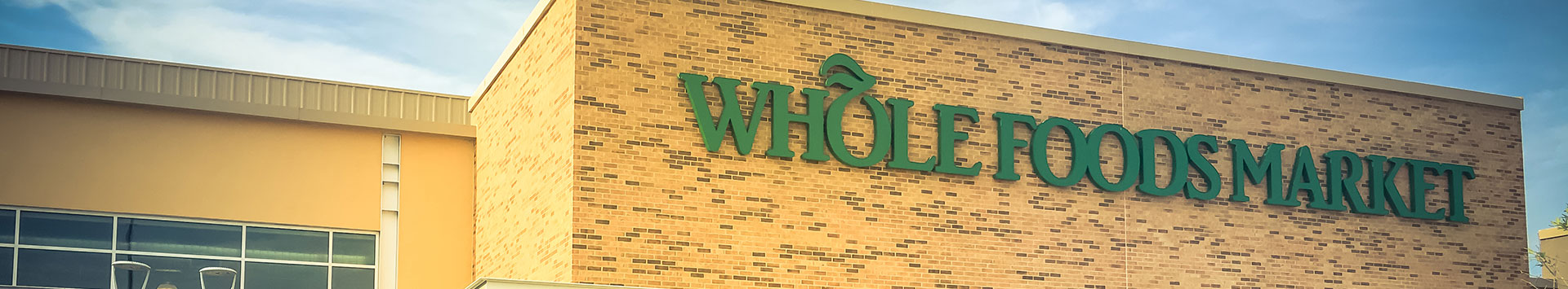
Today’s building signs are expected to do far more than announce your address. They communicate your brand’s personality before a customer reads a single word. They create emotional responses through material choices, lighting design, color temperature, and spatial composition. They integrate with the architecture of the building itself, either complementing it or deliberately contrasting it for visual impact.
I worked with a tech company moving into a new office space in Lehi’s tech corridor. Their previous office had a basic vinyl sign on the front door. For the new space, we designed an architectural signage package that included a brushed aluminum monument at the parking entrance, dimensional acrylic letters on the building facade, and a coordinated interior suite with branded directional signage through every hallway. The CEO told me that candidates coming in for job interviews started commenting on how “legit” the company felt before they even sat down. That perception shift came entirely from signage — not headcount, not revenue, not office furniture. Signs.
The evolution from functional markers to brand experience tools is the single biggest shift in the signage industry over the past decade. And if your building signs haven’t evolved with that shift, they’re actively working against you.
Also Read:
From Empty Space to Strong Brand: How Complete Signage Transforms Utah Retail Stores
Materials Have Changed the Game Completely
The materials available for building signs in 2026 would be unrecognizable to a sign maker from the 1990s. And honestly, even compared to ten years ago, the leap in quality, durability, and aesthetic range is dramatic.
Acrylic signs have become one of the most popular choices for businesses that want a modern, polished look. Clear, frosted, or color-matched acrylic can be laser-cut into virtually any shape, layered for depth, edge-lit for a subtle glow, or combined with standoff mounts that float the sign off the building surface. The result is clean, contemporary, and eye-catching without being loud.
A medical practice in Sandy recently switched from a flat vinyl-on-aluminum panel to a layered acrylic sign with their logo routed from half-inch clear acrylic mounted on a painted acrylic backer. The depth and light refraction give it a premium, clinical feel that perfectly matches their brand. And the material is holding up beautifully — acrylic is UV-resistant, weather-durable, and cleans easily.
Aluminum composite panels (like Dibond) remain a staple for flat-panel building signs because they’re lightweight, rigid, and incredibly durable in Utah’s harsh climate swings. We use them extensively for everything from tenant identification panels to large-format building graphics.
Metals — stainless steel, brushed aluminum, cor-ten steel, brass — are showing up more and more in building sign fabrication as businesses look for materials that feel substantial and permanent. A raw steel letter that develops a natural patina over time tells a completely different brand story than a glossy acrylic panel. Both are valid. The choice depends on what story your business needs to tell.
Mixed material combinations are where the real design magic happens. Metal letters on a wood backer. Acrylic logos floating in front of a steel frame. Painted aluminum channel letters mounted on an exposed concrete wall. These material pairings create visual contrast and texture that flat, single-material signs simply cannot achieve.
At Visibility Signs & Graphics, we keep a wide range of materials in-house and can source specialty substrates for unique projects. Material selection is one of the first conversations we have during design because it influences everything that follows — fabrication method, mounting approach, lighting integration, and long-term maintenance.
Illumination Is No Longer Optional
If your building sign isn’t illuminated, you’re essentially closed to anyone who passes by after dark. In Northern Utah, where winter daylight fades before most businesses close, that’s a massive visibility gap.
Lighted signs have become the expectation — not the upgrade — for any commercial building that wants to be taken seriously after sunset. And the technology behind sign illumination in 2026 is leagues ahead of the old neon tubes and fluorescent ballasts that defined previous generations.
Front-lit channel letters remain the workhorse for maximum readability. LED modules behind translucent acrylic faces produce bright, even illumination that’s visible from hundreds of feet away. They consume a fraction of the energy that older technologies required, they last for years without module replacement, and they’re available in a full spectrum of color temperatures.
Halo-lit (reverse-lit) letters push illumination backward against the mounting surface, creating a sophisticated ambient glow around each letter. This approach is increasingly popular with professional services, healthcare, and upscale retail — any brand that wants to project elegance rather than shouting for attention.
Edge-lit acrylic panels use LED strips positioned along the edges of a clear or frosted acrylic sheet, causing the entire panel to glow evenly. It’s a striking modern look that works particularly well for interior building signs and lobby displays, but it’s increasingly being used on exteriors too.
Externally lit signs use gooseneck lamps or linear LED fixtures mounted above or below the sign to wash light across the face. This is a classic approach that works beautifully with dimensional letter signs where internal illumination isn’t practical — like solid metal or wood letters.
The lighting choice affects more than just nighttime visibility. It fundamentally shapes the mood and personality of your building’s exterior. A warm white halo glow says something entirely different than bright, cool white front-lit letters. We spend time with every client discussing not just whether to illuminate but how — because the wrong lighting choice can undermine an otherwise great sign design.
Smart Design Principles That Separate Great Signs From Forgettable Ones
I’ve seen thousands of building signs across Utah. The ones that actually work — the ones that attract customers, build recognition, and make businesses money — follow a handful of design principles that haven’t changed even as technology has evolved.
Readability from distance. Your sign needs to be legible at the speed and distance your audience is traveling. A sign facing a 45-mph road has completely different requirements than one facing a pedestrian sidewalk. Font size, letter spacing, contrast ratio, and mounting height all need to be calibrated to the specific viewing conditions at your location. This sounds basic, but I’d estimate half the building signs I see fail this test.
Visual hierarchy. The most important information — usually your business name — should dominate the sign. Secondary information like a tagline or descriptor should be noticeably smaller. Tertiary details like a phone number or website should be smallest of all, if they’re included at all. When everything on a sign is the same size and weight, nothing stands out and the viewer’s eye has nowhere to land.
Contrast and color. Light letters on a dark background or dark letters on a light background. That’s the formula for maximum readability. Businesses that try to match letter color to background color for an “elegant” look often end up with signs nobody can read from more than twenty feet away. Elegance means nothing if it’s invisible.
Simplicity. The best building signs I’ve ever designed had the fewest elements. Your name. Your logo. Maybe a single descriptor. That’s it. If you need to communicate detailed information — services, hours, contact details — save that for your website, your window graphics, your directional signage, or your lobby displays. The building sign’s job is to identify and attract, not to educate.
At Visibility Signs & Graphics, we build these principles into every project from the initial concept phase. We create scaled mockups showing exactly how the sign will look on the actual building from actual viewing distances — so there are no surprises after sign installation is complete.
ADA Compliance Is Part of the Building Sign Conversation
When we talk about building signs, people tend to think exclusively about the big exterior sign on the facade. But the regulatory reality is that your building’s signage extends well beyond the front wall — and ADA signs are a legal requirement for most commercial buildings in Utah.
ADA-compliant signage includes room identification signs, restroom signs, exit signs, stairwell identifiers, and other interior markers that must meet specific standards for tactile characters, Braille, mounting height, contrast, and finish. These aren’t optional. They’re federal law under the Americans with Disabilities Act, and non-compliance can result in complaints, lawsuits, and fines.
But here’s what frustrates me: most businesses treat ADA signs as an unpleasant obligation. They order the cheapest stock signs they can find online and slap them up to check the box. The result is a beautiful building with gorgeous exterior signage and then a hallway full of generic brown plastic ADA signs that look like they came from a hospital supply catalog.
It doesn’t have to be that way. ADA signs can be custom-designed to match your brand’s color palette, typography (within ADA font requirements), and material aesthetic. We fabricate ADA-compliant signs in acrylic, painted metal, and specialty substrates that integrate seamlessly with the rest of a building’s signage package. Raised tactile characters and Grade II Braille are incorporated into the design — not slapped on as an afterthought.
A co-working space in Provo asked us to create their entire interior sign system including ADA room IDs, directional signage, and common area markers. We designed everything in a consistent style — dark charcoal backgrounds with clean white sans-serif type, clear acrylic standoff mounts, and properly placed Braille. The result looked intentional and premium throughout the entire building. Visitors assumed it was a high-end fit-out. It was actually just thoughtful signage design.
Wayfinding and Directional Signs Complete the Building Experience
A well-signed building doesn’t just tell people where you are — it tells them where to go once they arrive. And for any building larger than a single storefront, directional signage is essential to the customer experience.
Think about the last time you walked into an unfamiliar office building and couldn’t figure out which way to go. No directory. No arrows. No floor identification. You wandered. You felt frustrated. You probably formed a slightly negative impression of whatever business you were there to visit — even though the signage failure wasn’t their fault.
Now flip that. Imagine walking in and immediately seeing a clean directory sign in the lobby, clear directional signs at every corridor junction, and branded floor graphics guiding you to the elevator. You find your destination effortlessly. You feel taken care of. You associate that positive experience with the business you’re visiting.
That’s the power of a complete building sign system — exterior identification plus interior navigation working together as one unified experience.
We design directional signage programs for multi-tenant office buildings, medical centers, corporate campuses, and retail plazas across Northern and Central Utah. Every program starts with a flow analysis: how do people enter the building? Where are the decision points? What information do they need at each junction? From there, we design a sign family — a coordinated set of signs that share a common visual language — and map them to every decision point in the building.
Floor graphics are an increasingly popular addition to these wayfinding systems, especially in large buildings where overhead signs might not be visible due to ceiling height or obstructions. Branded floor paths can guide visitors directly to their destination while reinforcing your brand’s visual identity at ground level. We’ve installed floor graphic wayfinding systems in medical facilities and corporate lobbies that visitors actually compliment — which is a pretty remarkable thing for something you walk on.
Why Professional Sign Installation Matters More Than People Realize
I need to address this because it’s a behind-the-scenes factor that directly affects how your building signs look and perform — but most business owners never think about it.
A beautifully designed and fabricated sign can look terrible if it’s installed poorly. Crooked mounting. Uneven spacing between letters. Visible wiring. Damaged building surfaces. Incorrect height relative to sight lines. These are all installation failures that undermine your investment.
Professional sign installation requires specialized equipment — lifts, cranes, anchoring systems — and experienced technicians who understand structural mounting, electrical connections, waterproofing, and local building codes. It also requires coordination with property managers, landlords, and sometimes city inspectors for permit sign-offs.
At Visibility Signs & Graphics, installation is handled by our own trained crew — not subcontracted out to a general handyman. We’ve installed building signs on concrete, brick, stucco, metal panels, glass curtain walls, wood siding, and just about every other surface you’ll find on a commercial building in Utah. We know which anchoring systems work for which substrates, how to route wiring cleanly, and how to ensure every letter is level, plumb, and evenly spaced.
This is one of those areas where cutting corners costs you more in the long run. A botched installation means service calls, realignment, potential damage to your building, and a sign that never quite looks right. Getting it done properly the first time is always the better investment.
Also Read:
The Complete Guide to Sign Design, Installation & Repair in Utah
Your Building Is Talking — What Is It Saying?
Every commercial building in Central and Northern Utah is communicating something to the people who pass it. Some buildings say “thriving, professional, trustworthy.” Others say “neglected, outdated, not worth stopping.” The difference almost always comes down to the signs.
Your building signs are working for you or against you right now — there’s no neutral. They’re either attracting customers, reinforcing your brand, and generating impressions that compound over time, or they’re silently driving people toward your competitors who invested more thoughtfully in their signage.
The evolution of building signs has given businesses more tools than ever to make powerful first impressions. Better materials. Smarter lighting. Cleaner design. Integrated wayfinding. ADA compliance that actually looks good. The only question is whether you’re taking advantage of those tools or still relying on something that made sense a decade ago.
At Visibility Signs & Graphics, we help businesses across Utah — from Provo and Orem to Salt Lake City, Sandy, Lehi, Park City, and beyond — design, fabricate, and install building signs that genuinely move the needle. If your current signage isn’t saying what your business deserves, let’s fix that. Reach out to our team and let’s talk about what your building could be communicating to every single person who sees it.
Because they’re already looking. Let’s make sure they like what they see.
Back