Why Patients Get Confused in Hospitals (And How Proper Signage Can Fix Navigation & Experience)
Every day, thousands of patients walk into hospitals feeling anxious, unwell, or uncertain. They are already dealing with health concerns, emotional stress, and sometimes physical pain. The last thing they need is to spend ten minutes wandering a maze of identical corridors trying to find the radiology department or the correct check-in desk.
Yet this happens constantly in hospitals across the country. Patients arrive at the wrong entrance. They take the wrong elevator. They end up on the wrong floor. They ask nurses for directions three times before reaching the right room. And by the time they finally arrive at their appointment, they are late, flustered, and their overall impression of the facility has already taken a hit — before a single medical interaction has occurred.
The root cause of most of this confusion is not poor building design or insufficient staffing. It is poor signage. Specifically, it is the absence of a thoughtful, consistent, and complete hospital navigation signage system.
In this article, we explore exactly why patients get confused inside hospitals, what the real cost of that confusion is, and how the right directional and wayfinding signage can fix the problem entirely.
The Real Reasons Patients Get Lost in Hospitals
Understanding why patients get lost is the first step toward fixing the problem. Hospital navigation confusion rarely comes from a single cause. It is almost always the result of several overlapping signage failures happening at once.
Hospitals Are Genuinely Complex Buildings
Unlike a retail store or office building, hospitals are among the most architecturally complex facilities that the general public regularly enters. A mid-size regional hospital might have eight or ten floors, multiple wings, dozens of departments, separate outpatient and inpatient zones, multiple elevator banks serving different sections, and several different entrances depending on whether you are a patient, visitor, emergency case, or vendor.
This complexity is unavoidable. Hospitals grow over time. Wings get added. Departments move. Buildings connect through corridors that were not originally designed to flow together. The physical environment naturally creates confusion — and the signage system must compensate for it.
When signage fails to match the complexity of the building, patients are left to navigate by instinct and guesswork.
Signage Is Often Added as an Afterthought
In many hospitals, signage was not planned as part of the original facility design. Signs were added over time as problems became obvious — a sign here when staff complained about misdirected visitors, a sign there when a department moved to a new floor. The result is a patchwork system with no visual consistency, inconsistent terminology, missing signs at critical decision points, and conflicting information from one sign to the next.
A patient might follow a sign pointing left toward the cardiology department, then reach an intersection where cardiology is not mentioned at all, forcing them to guess — and often guess wrong.
Signage Uses Medical or Technical Language Patients Do Not Understand
Many hospital signs use clinical or administrative language that is clear to staff but meaningless to patients. A sign reading “Diagnostic Imaging” may confuse a patient who was told by their doctor to go to “X-ray.” A sign reading “Ambulatory Care” means nothing to a patient looking for the outpatient clinic. Signs for “Phlebotomy” leave patients who need a blood draw completely lost.
When sign language does not match the words patients actually use and hear from their doctors, the signs stop functioning as navigation tools and become invisible noise.
Decision Points Are Left Unsigned
Navigation research shows that people make navigation decisions at specific moments — when they enter a building, when they reach a corridor intersection, when they approach an elevator, when they step off an elevator onto a new floor. These are called decision points, and they are the moments when a person most needs clear directional information.
In hospitals with poor navigation signage, many of these decision points are left completely unsigned. A patient steps off the elevator onto the fourth floor and sees nothing to tell them which direction leads to which department. They pick a direction at random. They walk one hundred feet before encountering any information. By that point, they are already lost.
Signs Are Damaged, Outdated, or Inconsistent
Hospitals that do have signage systems often suffer from years of neglect. Signs fade. Rooms change purpose, but the signs are not updated. Department names change after rebranding, but old signs remain. Some signs use an older logo while newer ones use a refreshed brand identity. Temporary paper signs get taped over permanent signs and then left in place for months or years.
When patients encounter outdated or inconsistent signage, they lose trust in the entire system. If one sign appears unreliable, every sign in the building becomes suspect.
The Real Cost of Poor Hospital Navigation
The confusion caused by inadequate hospital navigation signage is not just a minor inconvenience. It carries measurable costs across multiple dimensions of hospital performance.
Patient satisfaction scores drop.
Hospital patient satisfaction surveys — which directly influence hospital reimbursement rates and public reputation — consistently reflect the navigation experience. Patients who felt lost, confused, or disoriented report lower overall satisfaction scores even when the medical care they received was excellent. A poor navigation experience colors the entire visit.
Staff productivity suffers.
Every time a nurse stops what they are doing to give a patient directions, that is time taken away from patient care. In busy hospitals, staff report giving directions dozens of times per shift. Multiply that across an entire nursing staff over a year, and the productivity loss is significant.
Appointment delays increase.
Patients who get lost frequently arrive late at their destination. Late arrivals disrupt scheduling, reduce the number of patients that can be seen, and create a cascade of delays throughout the department’s appointment schedule.
Patient anxiety increases.
Patients entering a hospital are almost always already anxious. Being unable to find their destination amplifies that anxiety significantly. Elevated patient stress at the start of an appointment can affect clinical outcomes, particularly for procedures where patient calm is important.
Emergency response times are impacted.
In time-critical situations, visitors trying to find an emergency department entrance or family members searching for a patient in the ICU face life-affecting consequences when signage fails them.
How Proper Hospital Navigation Signage Fixes These Problems
The good news is that every one of these problems has a direct and proven solution through thoughtful, professionally designed hospital navigation signage. Here is how each component of a complete signage system addresses the specific causes of patient confusion.
Exterior Wayfinding Begins Navigation Before Patients Enter the Building
The navigation experience does not begin at the front door. It begins in the parking lot — or even on the approach road. Exterior hospital signage that clearly identifies different entrances (emergency, outpatient, main entrance, staff), directs drivers to the correct parking zone, and confirms which building patients need sets the entire visit off on the right foot.
When a patient parks at the correct entrance, walks directly into the correct lobby, and immediately sees a clear directory of departments and floors, their confidence and calm are established from the very start. That sense of orientation carries through the rest of the visit.
Lobby Directory Signs Answer the First Three Questions Immediately
The moment a patient walks into a hospital lobby, they have three questions: Where am I? Where do I need to go? How do I get there? A well-designed lobby directory sign — whether a large static panel listing floors and departments or a digital interactive display — answers all three questions within seconds of arrival.
This single sign, positioned prominently in the lobby, reduces reception desk traffic dramatically. Patients who can answer their own navigation questions do not need to queue at the reception desk just to ask which floor cardiology is on.
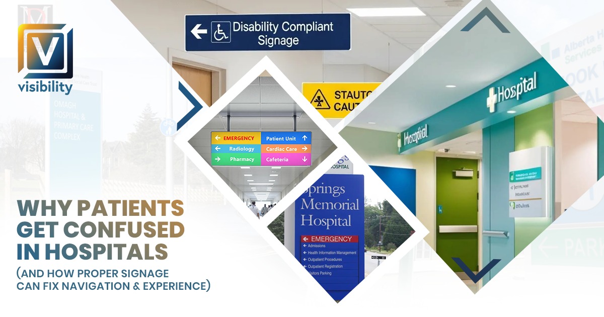
Consistent Directional Signs at Every Decision Point Eliminate Guesswork
A complete hospital wayfinding system places directional signs at every decision point throughout the facility — every corridor intersection, every elevator bank, every stairwell entrance, every department threshold. Signs include department names, directional arrows, and floor numbers so that patients always have the information they need at exactly the moment they need to make a navigation decision.
Consistency in design across all of these signs is critical. When every directional sign looks the same — same colors, same fonts, same icon style, same mounting height — patients quickly learn to look for and trust the system. Navigation becomes instinctive rather than stressful.
Plain Language and Pictograms Bridge the Communication Gap
Replacing clinical jargon with patient-facing language on signs is one of the most impactful and lowest-cost improvements a hospital can make to its navigation system. “X-ray & Imaging” is clearer than “Diagnostic Radiology.” “Blood Tests” is clearer than “Phlebotomy.” “Outpatient Clinic” is clearer than “Ambulatory Care.”
Adding universally recognized pictogram icons alongside text takes this further. Icons for a heart, a baby, a stethoscope, a cross, or a pair of lungs communicate department identity even to patients who have language barriers, reading difficulties, or significant anxiety that makes processing text harder.
Floor Graphics Create Pathways That Patients Can Literally Follow
One of the most effective innovations in hospital wayfinding is the use of adhesive floor graphics to create color-coded pathway lines from key entry points to major departments. Patients follow the blue line to cardiology. They follow the green line to the outpatient clinic. They follow the red line to the emergency department.
Floor pathway systems work because they require almost no cognitive effort to follow. Patients do not need to read, interpret, or remember anything. They simply look down and follow the line. Hospitals that implement floor pathway systems report dramatic reductions in navigation-related staff interruptions and patient confusion, particularly among elderly patients and first-time visitors.
Department Signs in Patient Language Build Confidence on Arrival
When a patient finally reaches their destination, the department identification sign outside the entrance should confirm their arrival clearly and immediately. A well-designed department sign using the patient’s own language — “Heart & Vascular Care” rather than “Cardiothoracic Medicine” — provides immediate reassurance that they are in the right place.
This moment of confirmation matters more than it might seem. For an anxious patient who has navigated a complex building, seeing their destination sign is a genuine moment of relief. It is the signage system completing its job successfully.
Elevator and Corridor Signs Prevent the Most Common Wrong Turns
The two most common places patients get lost in hospitals are long corridors and elevator transitions. Corridor signs at regular intervals — not just at intersections but also along long stretches of hallway — prevent patients from second-guessing their direction. Elevator lobby signs that clearly list which departments are found on which floors, and floor identification signs inside elevator banks, ensure that patients step off on the right floor every time.
ADA-Compliant Room Signs Serve Every Patient
Doctor nameplates, consultation room signs, and department entrance signs that include ADA-compliant tactile raised characters and braille ensure that visually impaired patients can navigate independently. Beyond legal compliance, these signs communicate that the hospital values and accommodates every patient — a message that is felt even by patients who never personally need the accessibility features.
Also Read:
Why Your Store Isn’t Attracting Customers (And How Outdoor & Indoor Signs Can Fix It Fast)
The Connection Between Signage and Patient Experience
It is worth stepping back and recognizing something important: patient experience is not just about clinical outcomes. It is about the totality of how a patient feels from the moment they decide to visit your facility to the moment they leave.
Signage is one of the very first and most persistent elements of that experience. It communicates organization, professionalism, and care before any staff member speaks a single word. A hospital with clear, beautiful, consistent signage feels like a facility that has its act together — a facility that cares about the details. That perception directly influences how much trust patients place in the clinical care they receive.
Conversely, a hospital with confusing, outdated, or missing signage feels chaotic and disorganized. Even if the medical staff is outstanding, the navigation experience has already planted seeds of doubt about the facility’s overall quality.
Investing in professional hospital navigation signage is not just an operational improvement. It is an investment in the patient relationship from the very first moment of contact.
What to Look for in a Hospital Signage Partner
Not every sign company has the experience, capabilities, or understanding of healthcare environments required to execute a complete hospital signage system. When selecting a signage partner for your facility, look for the following:
Healthcare experience.
Your signage partner should have direct experience working with hospitals and medical facilities, understanding the specific compliance requirements, material standards, and operational constraints involved.
ADA compliance expertise.
Every room identification sign must meet ADA standards. Your partner should be fully fluent in these requirements and build compliance into every applicable sign from the start.
Full project management capability.
A hospital signage project involves design, fabrication, permitting, and installation — often in a phased schedule coordinated around an active, occupied facility. Your partner needs to manage all of this without disrupting patient care.
Material knowledge for healthcare environments.
Signs in healthcare settings must withstand hospital-grade cleaning chemicals and disinfectants. Your partner should specify materials that are appropriate for the environment, not just visually appealing.
Brand alignment.
Every sign in your hospital should reinforce your brand identity. Your signage partner should have strong design capabilities and work within your brand guidelines consistently across every sign type.
How Visibility Signs & Graphics Help Hospitals Solve Navigation Challenges
At Visibility Signs & Graphics, we have worked with healthcare facilities to design, manufacture, and install complete wayfinding and navigation signage systems that genuinely transform the patient experience. We understand the complexity of hospital environments, the importance of ADA compliance, and the need for materials that stand up to healthcare-grade maintenance standards.
From exterior monument signs and parking directional signs to lobby directories, department identification signs, corridor wayfinding systems, floor graphics, doctor nameplates, and emergency signs — we design and build complete systems that work together as a unified, consistent navigation experience.
We serve hospitals and medical facilities in Provo, Salt Lake City, West Valley City, Clearfield, Park City, and throughout Utah. Our project management team handles every stage from initial audit through final installation, coordinating carefully around your facility’s schedule to minimize any disruption to daily operations.
If your hospital is experiencing patient navigation complaints, low satisfaction scores tied to the facility experience, or simply has signage that has not been updated in years, we would love to help.
Frequently Asked Questions About Hospital Navigation & Signage
Q: Why do patients get confused in hospitals even when staff are available to help?
A: Staff availability does not replace the need for clear signage. When patients rely entirely on staff for directions, it creates unnecessary interruptions to clinical work and adds delays to patient flow. Good signage allows patients to navigate independently, which reduces their stress and frees up staff to focus on patient care rather than giving directions repeatedly throughout the day.
Q: What is the most common navigation mistake hospitals make with their signage?
A: The most common mistake is leaving key decision points unsigned. A decision point is any place where a patient needs to choose a direction — a corridor intersection, an elevator lobby, a stairwell entrance. If a sign is missing at even one of these moments, a patient will likely take a wrong turn. A complete wayfinding system ensures no decision point is left without clear directional information.
Q: How does poor hospital signage affect patient satisfaction scores?
A: Patient satisfaction surveys measure the entire experience, not just clinical care. When patients feel lost, confused, or disoriented inside a facility, their overall satisfaction drops — even if the medical treatment they received was excellent. Hospitals with clear, professional navigation signage consistently score higher on satisfaction surveys because patients feel the facility is organized, welcoming, and respectful of their time.
Q: What is the difference between wayfinding signs and directional signs in a hospital?
A: Directional signs are a subset of wayfinding. Directional signs use arrows and department names to tell patients which way to go at a specific point. Wayfinding is the broader system — it includes everything from exterior parking signs and lobby directories to floor graphics, elevator signs, department identification, and room signs. A complete wayfinding system uses directional signs as one of many tools to guide patients through the entire facility from start to finish.
Q: Can hospital signage really reduce anxiety for patients?
A: Yes, and the connection is well established. Patients entering a hospital are almost always experiencing some level of stress or anxiety tied to their health situation. Being unable to find their destination amplifies that anxiety significantly. When a patient can navigate a hospital easily and confidently, they arrive at their appointment calmer and more at ease. That emotional state has a direct impact on how the clinical interaction begins — and in some cases, on clinical outcomes as well.
Q: How often should a hospital update or audit its signage system?
A: Hospitals should conduct a full signage audit any time a department moves, a building expansion or renovation occurs, or a rebranding takes place. Beyond those triggers, a general review every two to three years is a good practice to catch signs that have faded, become outdated, or no longer reflect current department names and layouts. Outdated signs erode patient trust in the entire navigation system, so keeping signs current is just as important as having them in the first place.
Q: Is color coding an effective strategy for hospital wayfinding?
A: Color coding is one of the most effective strategies available for large hospitals with multiple departments or buildings. When each department or zone is consistently associated with a specific color — carried through on directional signs, floor graphics, elevator lobbies, and department entrance signs — patients quickly learn the system and can follow it even without reading every word. It reduces cognitive load, which is especially valuable for elderly patients, patients with anxiety, or first-time visitors who feel overwhelmed by the environment.
Q: What should a hospital do if its signage system was never professionally designed?
A: The best starting point is a professional signage audit. A signage specialist walks the entire facility, maps every existing sign, identifies missing decision points, flags outdated or non-compliant signs, and assesses overall consistency. From that audit, a complete signage plan is developed that brings the entire facility up to a consistent, patient-friendly standard.
Also Read:
Shop Renovation Guide in Utah: From Flex Printing to Window Graphics
Conclusion
Patients get confused in hospitals because hospitals are complex, and because signage systems in most facilities were not designed with the patient’s perspective in mind. The result is a daily experience of confusion, anxiety, and frustration that affects patient satisfaction, staff productivity, and the hospital’s overall reputation.
But the fix is not complicated. A thoughtful, professionally designed hospital navigation signage system — one that covers every zone from the parking lot to the consultation room, uses patient language, places signs at every decision point, and maintains visual consistency throughout — eliminates the vast majority of navigation confusion.
Proper signage does not just help patients find their way. It tells every patient who walks through your doors that your hospital is organized, professional, and cares about their experience from the very first step. That message is worth far more than the cost of the signs themselves.
Back