How to Design Hospital Signs That Meet Safety Standards (ADA, Warning Signs & Directional Systems)
Introduction: Why Hospital Sign Design Is More Than Just Aesthetics
Walk into any hospital, and within the first sixty seconds, you are relying entirely on signage. You are looking for a department name, following a directional arrow, scanning a lobby directory, or reading a room number. In those moments, the quality of hospital sign design is not a background detail — it is the thing that determines whether your experience is calm and efficient or stressful and disorienting.
But hospital sign design carries responsibilities that go far beyond navigation. Unlike signs in a retail store or office building, hospital signs operate in an environment where clarity, accuracy, and compliance can directly affect human safety. A missing hazard warning sign in a radiology suite can expose patients and staff to radiation risk. A non-compliant room identification sign excludes visually impaired patients from independent navigation. An unclear emergency exit sign can endanger lives during an evacuation.
This is why hospital sign design is governed by multiple overlapping standards — the Americans with Disabilities Act (ADA), OSHA safety sign requirements, ANSI Z535 design standards, and local building codes — all of which must be satisfied simultaneously alongside the practical requirements of legibility, durability, and brand consistency.
In this comprehensive guide, we break down exactly what it takes to design hospital signs that meet every applicable safety standard. Whether you are building a new facility, renovating an existing one, or auditing your current signage system, this guide gives you the complete picture — from ADA compliance and OSHA warning signs to directional system design and material selection.
Why Hospital Sign Design Standards Exist
Before diving into the technical requirements, it helps to understand why these standards exist and what they are designed to protect.
Protecting Patients with Disabilities
The ADA was signed into law in 1990 specifically to ensure that people with disabilities have equal access to public facilities — including hospitals. For visually impaired patients, a room identification sign without tactile characters and braille is not just inconvenient. It is a barrier to independent access that the law explicitly prohibits.
Approximately 12 million Americans over the age of 40 have some form of visual impairment. In a hospital environment — where the patient population skews older and often includes people managing conditions that affect vision — accessible sign design is a direct patient care obligation.
Protecting Staff and Patients from Physical Hazards
Clinical environments contain hazards that simply do not exist in most other workplace settings — ionizing radiation, biological agents, hazardous chemicals, high-voltage electrical equipment, and infectious disease isolation areas. OSHA and ANSI safety sign standards exist to ensure that everyone who enters these areas — patients, staff, contractors, and visitors — receives a clear, standardized warning about the hazard they are approaching and the protective measures required.
Creating Consistent, Navigable Environments
Beyond protecting specific groups, hospital sign design standards exist to create consistency. When every hospital in the country uses the same color coding for danger and warning signs, the same tactile character specifications for room signs, and the same visual character standards for directional signs, healthcare environments become predictable and navigable — even to a first-time visitor in an unfamiliar city.
ADA Requirements for Hospital Sign Design
The ADA is the most comprehensive standard governing hospital interior signage. Understanding precisely what it requires — and which signs it applies to — is the starting point for any compliant hospital sign design project.
Which Signs Must Be ADA Compliant
The ADA distinguishes between different sign types based on their function and permanence. Here is exactly which hospital signs require full ADA compliance:
Signs requiring full ADA compliance — tactile characters, braille, finish, contrast, and mounting:
- Room identification signs for all permanent rooms — consultation rooms, examination rooms, treatment rooms, offices, and patient rooms
- Restroom identification signs
- Permanent department identification signs at department entrances
- Stairwell floor level signs
- Elevator floor identification signs
Signs requiring visual character compliance only — no tactile or braille required:
- Corridor directional signs and wayfinding arrows
- Overhead hanging signs
- Building directories and floor maps
- Informational signs that describe the overall layout of a space
Signs exempt from ADA requirements:
- Temporary signs posted for seven days or fewer
- Menus and pricing displays
- Signs in non-occupiable spaces such as mechanical rooms
Understanding this distinction is critical. Many hospitals make the mistake of applying full ADA compliance requirements to signs that do not need them — or worse, failing to apply them to signs that do.
Tactile Character and Braille Requirements
For all permanent room identification signs, the ADA requires the following tactile specifications:
- Raised characters — all letters, numbers, and symbols must be raised a minimum of 1/32 inch from the sign surface
- Character height — raised characters must be between 5/8 inch and 2 inches tall
- Font style — uppercase letters only for tactile characters, with no italics, oblique, script, or highly decorative typefaces permitted
- Character proportion — character width must be between 55 and 110 percent of character height, ensuring letters are not excessively condensed or expanded
- Grade 2 braille — contracted braille must appear directly below the corresponding raised text, with dot base diameter between 0.059 and 0.063 inches, dome-shaped, and spaced to ANSI A117.1 specifications
- Pictogram fields — where pictogram symbols are used, they must appear in a field at least 6 inches tall, with a verbal description in raised characters and braille below the pictogram
Finish and Color Contrast Requirements
Visual accessibility requirements for ADA hospital signs are just as important as the tactile requirements:
- Non-glare finish — all sign surfaces, including characters and backgrounds, must use a matte or eggshell finish. Gloss finishes create reflective glare that dramatically reduces legibility for visually impaired users and are explicitly prohibited by the ADA
- Light-reflectance value contrast — characters and their background must have a light-reflectance value (LRV) difference of at least 70 percent. White characters on a dark navy background, dark charcoal characters on a white background, or high-contrast brand color pairings all typically meet this requirement
- Character color vs background color — either the characters or the background must be the lighter of the two; either configuration is acceptable as long as the 70 percent LRV contrast is achieved
Mounting Height and Position Requirements
Where a sign is placed is as important as how it is designed. ADA mounting specifications for permanent room identification signs are precise:
- Signs must be mounted on the wall on the latch side of the door — not on the door itself
- The centerline of the sign must be exactly 60 inches above the finished floor
- Where there is no wall space on the latch side — for example, at double doors — the sign is mounted on the nearest adjacent wall
- A clear floor space of at least 18 inches by 18 inches must be maintained in front of the sign to allow a wheelchair user to approach and read the tactile elements
- Signs must not protrude more than 4 inches from the wall into the path of travel if their leading edge is between 27 and 80 inches above the floor
Visual Character Requirements for Directional Signs
Directional and informational signs do not require tactile characters or braille but must meet visual character standards:
- Minimum character height of 3 inches for signs intended to be read from 10 feet away, with height scaling proportionally for greater viewing distances — the formula is approximately one inch of character height per ten feet of viewing distance
- Sans-serif or simple serif typefaces only — no script, decorative, or condensed display fonts
- High contrast between characters and background, meeting the same LRV standard
- No italic or oblique styling, which reduces legibility at a distance and under low light
OSHA and ANSI Safety Warning Sign Standards for Hospitals
While the ADA governs accessibility, OSHA and ANSI govern safety and hazard warning communication in workplace environments — including all clinical, laboratory, utility, and support areas of hospitals.
The OSHA Color Coding System
OSHA’s safety color code system provides a standardized visual language for hazard communication that all hospital sign designers must follow without deviation:
- Red — danger, prohibition, fire protection. Used for “Danger” signal word signs, fire extinguisher and suppression equipment signs, emergency stop controls, and biohazard waste disposal indicators
- Orange — warning for serious hazards that may cause severe injury or death. Used for high-voltage electrical panels, heavy equipment, radiation equipment warnings, and machinery guards
- Yellow — caution for lesser hazards and unsafe conditions. Used for “Caution” signal word signs, wet floor warnings, trip hazard notices, and non-critical equipment warnings
- Green — safety and first aid information. Used for first aid station signs, AED defibrillator locations, emergency eyewash and shower stations, and general safety equipment locations
- Blue — notices and non-hazard informational signs. Used for mandatory action instructions, facility policy notices, and general informational signs that do not involve physical hazards
ANSI Z535 Design Standards
The ANSI Z535 series of standards provides detailed design specifications for safety signs that work alongside OSHA color requirements. Key ANSI Z535 elements that apply to hospital sign design include:
- Signal word panels — the words “DANGER,” “WARNING,” “CAUTION,” and “NOTICE” each have defined layouts, font sizes, and color backgrounds. DANGER uses white text on red. WARNING uses black text on orange. CAUTION uses black text on yellow. NOTICE uses white text on blue
- Safety symbols — ANSI Z535.3 defines a library of standardized safety symbols for use alongside signal words, including symbols for radiation, biological hazard, electrical hazard, flammable materials, and dozens of other hospital-relevant hazards
- Legibility distance — ANSI Z535 specifies minimum character heights based on the required reading distance, ensuring safety signs are legible before a person enters the hazard zone
- Multi-panel sign layout — for complex hazard communication signs that combine a signal word panel, safety symbol, and instructional text, ANSI Z535 specifies the layout relationships between these elements
Critical Safety Sign Categories in Hospital Environments
Every hospital — regardless of size — requires the following safety sign categories designed to OSHA and ANSI standards:
Radiation hazard signs:
- Required at all entrances to radiology departments, X-ray rooms, CT and MRI suites, fluoroscopy rooms, nuclear medicine areas, and radiation therapy zones
- Must display the international radiation trefoil symbol in magenta on yellow, with the appropriate signal word panel
- Must specify the nature of the radiation area and any required protective equipment or access restrictions
Biological hazard signs:
- Required at laboratory entrances, biomedical waste storage and handling areas, infectious disease isolation rooms, and any area handling blood or bodily fluids at volume
- Must display the biohazard symbol in fluorescent orange or orange-red
- Must identify the specific biological hazard and required personal protective equipment
Chemical hazard signs:
- Required in pharmacy compounding areas, laboratory chemical storage, cleaning supply storage, sterilization, and disinfection rooms
- Must comply with GHS Hazard Communication Standard labeling requirements where chemicals are stored
- Must use appropriate ANSI signal word panels based on the hazard severity
Electrical hazard signs:
- Required on high-voltage electrical panels, electrical equipment rooms, generator facilities, and any area with exposed electrical risk
- Must use ANSI-compliant “WARNING” or “DANGER” signal word panels in orange or red, respectively
Fire safety signs:
- Illuminated exit signs are required by NFPA 101 Life Safety Code at all exit doors and along egress paths — these must be continuously illuminated and maintained on emergency power
- Fire extinguisher location signs must be clearly visible and unobstructed
- Fire door signs — “Fire Door — Keep Closed” or “Fire Door — Do Not Block” — are required on all fire-rated corridor and stairwell doors
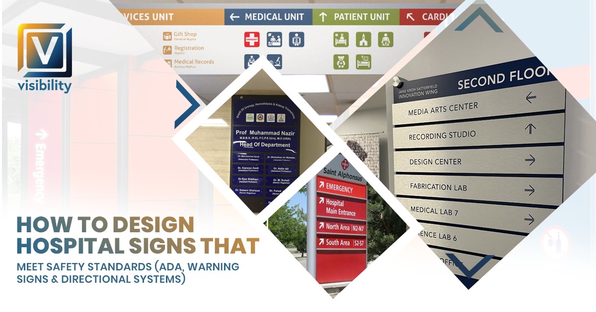
Designing a Complete Hospital Directional Sign System
Compliance addresses the technical floor — the minimum standards every sign must meet. But effective hospital sign design goes further, creating a directional system that makes navigation genuinely intuitive for the widest possible range of patients and visitors.
Start with a Wayfinding Audit
Before designing any new directional signage, a wayfinding audit is essential. This involves physically walking every patient route through the facility — from every entrance to every major destination — and documenting:
- Every decision point where a patient must choose a direction
- All existing sign locations, conditions, accuracy, and legibility
- Gaps where no sign exists but one is needed
- Signs that are present but confusing, contradictory, or outdated
- Feedback from patients, visitors, and frontline staff about navigation difficulties
The audit creates an evidence-based blueprint for the entire directional sign system rather than a design based on assumptions about where patients get confused.
Building a Visual Hierarchy
A functional hospital directional sign system requires a clear visual hierarchy — different sign types at different scales for different navigation functions:
Primary signs — major destinations:
- Largest format, highest mounting position — often overhead or at corridor entry points
- Located at main building entrances, lobby, and primary corridor junctions
- Show the highest-level destinations: Emergency Department, Main Entrance, Inpatient Units, Outpatient Clinics, Parking, Elevators
Secondary signs — department-level navigation:
- Medium format at corridor height
- Located at every corridor intersection and elevator lobby
- Show department names with floor numbers and directional arrows
Tertiary signs — room-level identification:
- Smaller format at door level
- Room identification, department name confirmation, staff nameplates, and suite identifiers
- Full ADA compliance is required for all permanent room identification signs at this level
Typeface Selection
Font choice in hospital directional sign design is a decision with direct functional consequences. Research on wayfinding legibility consistently supports the following principles:
- Sans-serif typefaces — fonts such as Helvetica Neue, Frutiger, Clearview, or Arial significantly outperform serif and decorative fonts for legibility at distance and under stress conditions
- Mixed case — title case (uppercase first letter, lowercase remainder) is more legible than all-caps for destination names longer than one word, because the varied letterform silhouettes aid quick recognition
- Medium to bold weight — improves contrast and legibility in the variable lighting conditions of hospital corridors
- Generous letter spacing — slightly increased tracking improves legibility for patients reading signs while moving or under anxiety
Also Read:
Office Makeover Checklist: Everything You Need From Entrance Signs to Indoor Directional Signage
Color Coding for Department Navigation
Color coding is one of the most powerful tools in hospital directional system design. Applied consistently from exterior signs through lobby directories and interior corridor signs, it allows patients to follow a color rather than parse text at every decision point — dramatically reducing cognitive load.
Effective color coding principles for hospital sign design:
- Assign a distinct color to each major department or patient care zone — no more than six to eight colors in the system to prevent visual confusion
- Apply the assigned color on every sign related to that department at every level — exterior directional signs, lobby directory entries, corridor arrow signs, and department identification signs
- Use the hospital’s existing brand colors as the foundation of the color coding system, where possible, extending the palette for additional departments
- Verify that every color in the system meets ADA color contrast requirements against the sign background before finalizing
Arrow Design
The directional arrow is the single most critical graphic element in a hospital wayfinding system. Common arrow design failures include:
- Arrows are sized too small relative to the destination text, making them visually subordinate to the information they are guiding
- Ambiguous upward-pointing arrows that patients read as “above” rather than “straight ahead.”
- Signs with five or six arrow directions simultaneously, creating a visual overload that increases rather than reduces confusion
- Inconsistent arrow styles between different sign types in the same facility
Best practice is to design arrows that are at least as tall as the destination text characters, with unambiguous directional geometry, and applied consistently across every sign type in the system.
Material Selection for Compliant, Durable Hospital Signs
The materials used in hospital sign construction directly affect both compliance and long-term performance. Clinical environments impose specific requirements that differ from other commercial settings.
Interior Sign Material Requirements for Hospitals
All interior hospital sign materials must satisfy the following practical requirements, regardless of aesthetic considerations:
- Non-porous or fully sealed surfaces that do not harbor bacteria or absorb cleaning chemicals
- Compatibility with hospital-grade disinfectants, including quaternary ammonium compounds, hydrogen peroxide solutions, and bleach-based cleaners
- ADA matte or eggshell finish capability for all room identification signs
- Dimensional stability — materials must not warp, delaminate, or fade under repeated cleaning cycles
Recommended interior materials:
- Acrylic — available in any color, accepts digital printing, engraving, and applied vinyl graphics, ADA matte finishes readily available, excellent dimensional stability
- Brushed or anodized aluminum — premium appearance, highly durable, naturally non-porous, ideal for nameplates and department identification signs
- Aluminum composite panels — rigid, lightweight, excellent for large-format interior directional signs and directory panels
- PVC foam board — cost-effective for secondary signage, available in multiple thicknesses, printable and cutable to any shape
Exterior Sign Material Requirements
Exterior hospital signs must withstand the full range of environmental conditions — UV exposure, temperature cycling, wind, and precipitation — while maintaining legibility and professional appearance over years of service.
Recommended exterior materials:
- Aluminum cabinet signs — industry standard for illuminated exterior directional signs and identification signs, weather-resistant, accepts LED illumination
- Dimensional aluminum letters — long-lasting, weather-resistant building identification letters
- HDU (High Density Urethane) — excellent for carved monument sign faces, fully paintable, resists moisture and UV degradation
- 3M exterior vinyl graphics — for monument sign faces and directional sign panels, rated for extended outdoor service in full sun and cold climates
Common Hospital Sign Design Mistakes to Avoid
Understanding the most frequent failures in hospital sign design is as valuable as knowing the correct standards. These mistakes appear repeatedly in healthcare facility signage audits:
- Mounting room identification signs on doors instead of the latch-side wall — one of the most common and most straightforward ADA violations
- Using gloss finishes on ADA signs is immediately non-compliant and significantly reduces legibility for visually impaired users
- Inconsistent sign formats across departments — different materials, typefaces, and color treatments that make the facility look disorganized and undermine the navigation system
- Missing signs at decision points — the single most common cause of patient navigation failure in hospital corridors
- Incorrect braille placement — braille positioned too close to raised characters, at the wrong height, or using incorrect dot specifications that make it unreadable by touch
- Misapplied OSHA colors — using yellow for a danger-level hazard that requires red, or applying blue to a warning that should be orange
- Outdated directory content — room numbers, department names, and floor assignments that no longer match the current facility layout
- Ignoring multilingual needs — English-only signage in facilities serving diverse patient communities creates genuine accessibility barriers
How Visibility Signs & Graphics Designs Compliant Hospital Signs
At Visibility Signs & Graphics, we approach every hospital signage project with the understanding that compliance is the baseline — not the ceiling. Our role is to deliver signs that meet every applicable standard while also performing as genuinely effective navigation and communication tools for your patients and staff.
Our Hospital Sign Design Process
Every hospital signage project begins with a thorough compliance and wayfinding audit of your existing facility. We document every sign against current ADA, OSHA, and ANSI requirements and identify every gap in your navigation system. From that audit, we develop a complete signage plan that:
- Satisfies all ADA requirements for every applicable sign type
- Applies OSHA and ANSI standards to all safety and warning signs
- Establishes a consistent visual hierarchy and color coding system
- Aligns with your hospital’s brand identity and typography standards
- Accounts for your patient population’s specific needs — including bilingual requirements
We present the complete plan for client review and approval before any sign goes into production, and we manufacture every sign in our facility to the exact specifications in the approved design plan.
Our Healthcare Signage Services
- ADA-compliant room identification and nameplate systems
- OSHA and ANSI Z535 safety and warning signs
- Complete interior directional and wayfinding systems
- Exterior monument, parking, and building identification signs
- Emergency department entrance and interior signage
- Floor graphics and corridor pathway systems
- Bilingual sign design and manufacturing
- Full project management from audit through installation
We are 3M certified, ISA members, and affiliated with the United States Sign Council. Our team has the compliance knowledge, design capability, and installation experience to deliver hospital signage that works from day one and holds up for years.
Frequently Asked Questions
Q: What is the difference between ADA signs and OSHA signs in a hospital?
A: ADA signs govern accessibility — they ensure that patients and visitors with disabilities, particularly visual impairments, can independently navigate and identify rooms using tactile characters and braille. OSHA signs govern safety and hazard communication — they warn staff, patients, and visitors about physical hazards such as radiation, biological agents, electrical risks, and chemicals. Both are required in hospitals but apply to different sign types and locations.
Q: Do all hospital signs need Braille?
A: No. Only permanent room identification signs require tactile raised characters and Grade 2 braille under ADA requirements. These include examination rooms, consultation rooms, restrooms, stairwell floor identifiers, and elevator floor signs. Directional signs, overhead signs, lobby directories, and building maps do not require braille — but must meet visual character standards for legibility.
Q: What happens if a hospital’s signs are not ADA-compliant?
A: Non-compliant hospital signage can result in federal civil rights complaints filed with the Department of Justice, mandatory facility-wide remediation, legal fees, and potential fines. Facilities receiving Medicare or Medicaid funding may also face review processes that affect reimbursement eligibility. Beyond legal consequences, non-compliant signs actively exclude visually impaired patients from independent navigation.
Q: How do you choose the right colors for a hospital directional sign system?
A: Start with the hospital’s existing brand colors as the foundation. Assign distinct colors to each major department or zone — no more than six to eight total. Apply each color consistently across every sign type related to that department, from exterior parking signs through lobby directories and corridor directional signs. Before finalizing, verify that every chosen color meets ADA light-reflectance value contrast requirements against the sign background. Visibility Signs & Graphics tests all color combinations for compliance before any sign goes into production.
Q: What font should be used on hospital directional signs?
A: Sans-serif typefaces are strongly preferred for hospital directional signs based on legibility research. Fonts such as Helvetica Neue, Frutiger, Arial, or Clearview perform best for reading at a distance and under stress conditions. Avoid decorative, script, condensed, or italic typefaces, which significantly reduce legibility. For ADA room identification signs, uppercase only is required for tactile characters.
Q: How long does a hospital sign design project typically take?
A: For a targeted ADA compliance remediation covering room identification signs only, the timeline from audit to completed installation typically runs four to eight weeks. For a full facility-wide signage system — covering exterior, lobby, corridors, departments, safety signs, and all ADA elements — eight to sixteen weeks is a realistic timeline. Visibility Signs & Graphics provides a detailed project schedule during the initial consultation, with phased installation planned around your facility’s operational needs.
Q: How do we get started with a hospital sign design project?
A: Contact Visibility Signs & Graphics for a free consultation. Our team will visit your facility, conduct a compliance and wayfinding audit, and develop a custom signage plan with detailed specifications and pricing.
Also Read:
Why Your Restaurant Doesn’t Feel Premium (And How Signs, Lighting & Wall Graphics Can Fix It)
Conclusion
Designing hospital signs that meet safety standards is one of the most technically demanding and consequently important signage challenges in any built environment. Every sign must satisfy ADA accessibility requirements, OSHA and ANSI safety communication standards, and practical wayfinding design principles — simultaneously and without compromise.
The facilities that get hospital sign design right are the ones that understand these standards deeply, apply them consistently across every sign type and every zone of the building, and invest in materials and installation quality that hold up over years of clinical use.
For hospitals that fall short — through non-compliant room signs, missing safety warnings, confusing directional systems, or outdated directories — the consequences range from frustrated patients and overloaded staff to legal liability and genuine patient safety risks.
Visibility Signs & Graphics brings together compliance expertise, design capability, manufacturing quality, and professional installation to deliver hospital signage systems that meet every standard and serve every patient who walks through your door.
If your facility is ready to design or redesign its hospital signage system the right way, contact us today. We are ready to help.
Back