From Entrance to Emergency Room: Creating a Clear Navigation System with Effective Hospital Signage
Introduction: The Hidden Cost of Poor Hospital Navigation
Imagine arriving at a hospital for the first time. You are worried about a family member. You are running slightly late. You pull into the parking lot and immediately face a choice between three unmarked entrances. You pick one, walk in, and find yourself in a service corridor with no signs in sight. You backtrack. You ask a passing staff member. They point you in a direction. You walk for two minutes and realize you are in the wrong wing entirely.
This scenario plays out in hospitals across the country every single day. And it is entirely preventable.
Poor hospital navigation is not just an inconvenience. It is a patient care issue. Studies in healthcare facility design consistently show that patients who experience navigation difficulties arrive late for appointments, miss check-in windows, and report significantly lower satisfaction scores — regardless of the quality of medical treatment they receive. In emergencies, a missing or unclear directional sign can delay critical care by minutes that genuinely matter.
Effective hospital signage is the solution. A well-designed navigation system — covering every stage of the patient journey from the parking lot to the treatment room — eliminates confusion, reduces anxiety, frees up clinical staff from giving directions, and communicates the professionalism and care that define a great healthcare facility.
In this guide, we walk through every stage of that journey in detail and explain exactly what signage is needed at each step, what makes it effective, and how to build a complete hospital navigation system that works for every patient who walks through your doors.
Why Hospital Signage Is a Patient Care Investment
Before diving into the specific stages of hospital navigation, it is important to understand why investing in a professional signage system is a strategic decision — not just an operational one.
The Patient Experience Connection
Patient satisfaction is one of the most closely tracked metrics in modern healthcare management. Hospitals are evaluated on patient experience surveys that directly influence public reputation, physician referral rates, and in many cases, reimbursement rates tied to satisfaction benchmarks.
Signage affects patient satisfaction at multiple touchpoints throughout every visit:
- A patient who finds parking easily and locates the right entrance without confusion starts the visit in a calm, positive state
- A patient who navigates corridors independently without stopping to ask for help feels respected and capable
- A patient who finds their doctor’s nameplate on the correct door before entering feels reassured and confident
- A patient who locates the emergency entrance within seconds of arriving in a crisis feels that the hospital is organized and responsive
Every one of these moments is shaped by the quality of your signage system.
Also Read:
Shop Renovation Guide in Utah: From Flex Printing to Window Graphics
The Staff Efficiency Connection
Every time a nurse, receptionist, or clinical staff member stops what they are doing to give directions to a lost patient or visitor, that is time taken away from patient care. In busy hospitals, staff members can field dozens of navigation questions per shift — a cumulative drain on clinical productivity that a well-designed signage system eliminates almost entirely.
The Brand and Trust Connection
A hospital with clean, consistent, professional signage communicates organizational competence before any medical interaction takes place. Conversely, a hospital with outdated, inconsistent, or missing signs communicates disorganization — even if the clinical quality is exceptional. In a competitive healthcare environment where patients increasingly have choices about where they receive care, the physical environment is part of the brand.
Stage 1: Exterior and Parking Signage — The Journey Begins Before the Front Door
The patient navigation experience does not begin inside the hospital. It begins the moment a patient or visitor approaches the facility by road. Getting exterior signage right is the foundation of the entire navigation system.
The Challenges of Hospital Exterior Signage
Large hospitals and medical campuses present unique exterior navigation challenges:
- Multiple buildings that look similar from the road
- Several distinct entrances serving different functions — main entrance, emergency department, outpatient clinics, medical office buildings, ambulance bays
- Large parking areas with multiple zones for visitors, staff, and emergency drop-off
- Patients who are often driving alone, distracted by concern for themselves or a family member, and unfamiliar with the campus layout
What Effective Exterior Hospital Signage Includes
Road-facing monument signs:
- Large enough to be read clearly from moving traffic
- Prominently displaying the hospital name, logo, and any critical directional information
- Illuminated for visibility in early morning, evening, and adverse weather conditions
- Positioned far enough from the road that drivers have time to react and turn safely
Parking directional signs:
- Clearly separate visitor parking, staff parking, emergency drop-off, and valet zones
- Use consistent color coding to make zones immediately identifiable — visitors do not need to read every word if they learn that blue means visitor parking
- Include distance or arrow indicators so drivers know whether to turn now or continue forward
Building identification signs:
- On every structure in a multi-building campus, clearly identifying what is inside
- Large enough to read from the parking lot without binoculars
- Using the same visual language as every other sign on the campus for system consistency
Emergency department entrance signs:
- The most critical exterior signs on any hospital campus
- Must be the most visually prominent exterior signs — larger, brighter, and more conspicuous than any other entrance sign
- Illuminated at all hours — emergency situations do not observe business hours
- Supported by directional arrows from every parking area and approach road so that a driver arriving from any direction can find the ER entrance without hesitation
Accessible entrance signs:
- Clearly directing patients with disabilities, wheelchair users, and mobility device users to the appropriate entry points
- Compliant with ADA visual character requirements
Stage 2: Main Entrance and Lobby Signage — Setting the Navigation Foundation
The lobby is the most important interior signage zone in any hospital. It is where patients make their first interior navigation decisions and where the entire wayfinding system either establishes trust or creates confusion.
What the Lobby Must Communicate Immediately
Within the first thirty seconds of entering a hospital lobby, a patient or visitor should be able to answer three questions without asking anyone:
- Am I in the right building?
- Where is the department or person I need to see?
- How do I get there from here?
Every lobby sign is designed to answer one or more of these questions.
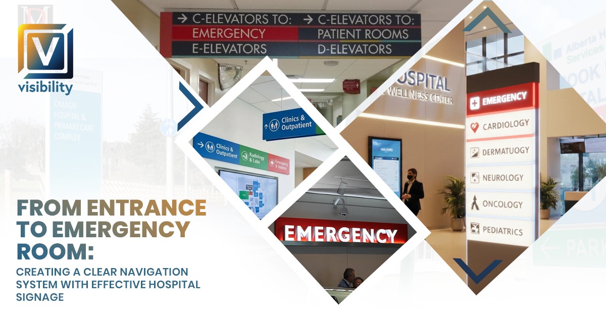
The Lobby Directory
The lobby directory is the single most important interior sign in any hospital. It needs to be:
- Prominently positioned — visible immediately upon entering, not tucked in a corner or behind a column
- Comprehensively organized — listing every department, floor, key service, and major destination with clear floor or room number indicators
- Logically structured — organized alphabetically, by floor, or by service category in a way patients can scan quickly
- Readable at a glance — using a clean sans-serif font, high contrast, and appropriate text size so patients can find their destination in under thirty seconds
Static printed directories work well for facilities with stable department layouts. Digital directories offer the advantage of real-time updates when departments relocate, hours change, or temporary services are added.
Building Identification and Reception Desk Signs
Dimensional letters or backlit channel letter signs on the reception desk wall or main lobby wall confirm the patient is in the right building and reinforce the hospital’s brand identity. These signs anchor the lobby space visually and communicate that this is a professionally managed, organized facility.
Lobby Directional Signs
Beyond the directory, the lobby should include directional arrows pointing toward the most frequently requested destinations:
- Emergency department
- Elevator banks and stairwells
- Outpatient registration and check-in
- Radiology and imaging
- Pharmacy
- Cafeteria and family waiting areas
- Restrooms
These signs should be positioned at eye level on walls and columns, and as overhead ceiling-mounted signs where the lobby space is large enough that wall signs may not be visible from all areas.
Visitor Policy and Safety Signs
Near the lobby entrance, visitor policy signs, infection control notices, and health and safety guidance signs should be clearly posted. These communicate hospital protocols immediately and help manage visitor behavior without requiring staff intervention.
Stage 3: Corridor and Wayfinding Signs — Guiding Every Step of the Journey
Once a patient leaves the lobby, they enter the corridor system — and this is where most hospital navigation failures happen. Long, identical-looking hallways, missing signs at critical intersections, and inconsistent directional information leave patients and visitors disoriented within minutes of leaving the main entrance.
The Decision Point Principle
The most important concept in corridor signage design is the decision point. A decision point is any location where a patient must actively choose a direction — any intersection, elevator bank, stairwell entry, or branch in the corridor. Every decision point must have a directional sign. Without exception.
At each decision point, the directional sign must show:
- The available destinations in each direction
- Clear arrows indicating the correct direction for each destination
- Floor numbers where relevant
- Color coding consistent with the department color system established in the lobby
Sign Frequency and the 30-Foot Rule
Decision points are the minimum requirement. Effective hospital corridor signage also ensures that a patient moving through any corridor can always see the next directional sign from where they are standing. A practical standard used in professional wayfinding design is to ensure a directional sign is visible within thirty feet of any position in the corridor.
Signs placed too far apart leave patients walking long distances with growing uncertainty about whether they are heading in the right direction. That uncertainty creates anxiety. And anxious patients stop, turn around, and ask staff for directions — exactly the disruption good signage is designed to prevent.
Color Coding Throughout the Corridor System
A color coding system introduced in the lobby should carry through every corridor sign in the facility. When a patient learns in the lobby that cardiology is identified by blue and oncology is identified by green, they can follow color cues through the corridor system without reading every sign in detail. This is particularly powerful for:
- Patients with lower health literacy or limited English proficiency
- Elderly patients who may find detailed reading more challenging under stress
- Visitors in an emotionally difficult state who are moving quickly and not processing text efficiently
Color coding also creates a cohesive, professional visual system that communicates organizational competence throughout the facility.
Floor Graphics as Navigation Tools
Floor graphics are a highly effective but frequently underutilized element in hospital corridor navigation. Adhesive pathway lines applied to corridor floors create a literal follow-the-line navigation experience:
- A red pathway line leads to the emergency department
- A blue pathway line leads to cardiology
- A green pathway line leads to outpatient clinics
The advantages of floor pathway graphics in hospitals are significant:
- They work for patients of all language backgrounds — no reading required
- They are visible even when corridors are crowded with staff, equipment, and other visitors
- They provide continuous navigation guidance between sign locations
- They are extremely effective for elderly patients and those with cognitive impairments who respond well to simple, linear guidance
Commercial-grade hospital floor graphics are manufactured from anti-slip laminated vinyl rated for heavy foot traffic, wheelchair use, and regular cleaning with hospital-grade disinfectants. When properly installed and maintained, they typically last three to five years.
Stage 4: Elevator and Stairwell Signs — Managing Vertical Navigation
Moving between floors is one of the most disorienting transitions for hospital patients. Elevator lobbies and stairwells are high-confusion zones that require specific signage to prevent patients from exiting on the wrong floor or using the wrong elevator bank.
Elevator Lobby Signs
At each elevator bank, lobby-level signs should clearly indicate:
- Which floors are served by this elevator bank
- Which departments are located on each served floor
- Whether this elevator is for public use, staff use, or service/freight use
Inside the elevator cab, floor-by-department listings allow patients to confirm their destination floor before the doors open. When the doors open, floor identification signs immediately visible from inside the elevator cab — showing the floor number and key departments — prevent passengers from stepping off on the wrong floor.
Stairwell Signs
Stairwell floor identification signs must meet ADA requirements with tactile characters and braille identifying the floor level. Inside stairwells, signs should additionally indicate:
- Whether the stairwell provides roof access or basement access
- Emergency exit route information
- Which floors are accessible from this stairwell
ADA requires that stairwell floor identification signs be mounted at each landing on the wall beside the door leading to the corridor — not on the door itself.
Also Read:
From Empty Walls to Fully Branded Store: Complete Signage Solutions for Retail Businesses in Utah
Stage 5: Department Identification Signs — Confirming the Destination
After navigating from the lobby through corridors and elevators, the patient’s final corridor-level navigation step is identifying the entrance to their specific department. Department identification signs are the confirmation that the journey is nearly complete.
What Effective Department Signs Include
- Department name in plain language — accessible to all patients regardless of medical literacy. “Heart and Vascular Center” is more navigable than “Interventional Cardiovascular Medicine”
- Sub-department information where relevant — for large departments with multiple service lines
- Hours of operation where applicable for outpatient and clinic areas
- Check-in or registration instructions if the check-in process begins at a specific location within the department
Consistency Across All Departments
Department identification signs should form a visually consistent family throughout the facility. The same materials, typography, mounting height, and format across every department reinforce the navigation system’s reliability. When every department sign looks like it belongs to the same system, patients trust that following signs consistently will lead them to the right place.
Overhead Versus Wall-Mounted Department Signs
For high-traffic departments or departments at the end of long corridors, overhead ceiling-mounted department signs are more effective than wall-mounted signs because they are visible from a greater distance and remain visible even when corridors are crowded. Wall-mounted signs work well for smaller departments and for the final identification sign directly adjacent to the department entrance.
Stage 6: Doctor and Staff Nameplates — The Final Confirmation
The nameplate outside a consultation room or doctor’s office is the last navigation element in the patient journey. It is also one of the most personal. Standing outside a consultation room, a patient reads the nameplate and gets final confirmation that they are in the right place, seeing the right physician.
What Doctor Nameplates Should Display
- Full name of the physician or healthcare professional
- Professional title and credentials
- Specialty or department
- Room or office number where relevant
ADA Compliance for Nameplates
Permanent room identification signs — including doctor nameplates — must comply with ADA requirements for tactile raised characters, Grade 2 braille, non-glare finish, color contrast, and mounting height. These requirements are not optional for permanent room identification signs in healthcare facilities.
Modular Systems for Operational Flexibility
Hospitals and medical office buildings where physicians rotate between rooms, share spaces, or change regularly benefit enormously from modular nameplate systems. These systems use a permanently mounted frame with a replaceable insert panel. When a physician changes rooms or a new staff member joins, only the insert is replaced — maintaining a consistently professional appearance without the cost and lead time of ordering entirely new signs.
Stage 7: Emergency Department Signs — When Navigation Is a Matter of Seconds
Every stage of hospital navigation matters, but emergency department signage carries uniquely high stakes. A patient arriving at the ER is often in pain, frightened, and possibly alone. Their ability to find the correct entrance and the check-in desk within seconds can directly affect clinical outcomes.
Exterior ER Signage Standards
The emergency department entrance must be the most conspicuous exterior sign on the campus. Requirements include:
- High-visibility illuminated signs — large format, internally lit, using red as the universal emergency color
- Maximum prominence — the ER entrance sign should be more visible than any other entrance sign from every approach road
- Directional signs from all parking areas — a patient should be able to find the ER entrance by following signs from any point on the campus without retracing steps
- Clear separation from main entrance and outpatient entrance signage — patients in crisis cannot afford to choose the wrong entrance
Interior ER Navigation Signs
Inside the emergency department, patients and families need immediate guidance to:
- Triage and check-in — the single most critical interior ER sign, visible within seconds of entering
- Waiting areas — clearly distinguished from triage and treatment zones
- Family waiting rooms — separate identification from main waiting areas
- Restrooms — accessible without assistance
- Staff-only areas — clearly marked to prevent patient or visitor entry into restricted zones
Emergency Safety Signs Within the ER
Emergency response signs inside the ER must be immediately visible and unobstructed at all times:
- AED and defibrillator locations
- Fire exit routes and emergency assembly points
- Fire extinguisher positions
- Emergency equipment stations
- Hazardous material handling zones
Stage 8: Restroom and Utility Signs — Completing the System
A complete hospital navigation system covers every sign type in the facility — including restroom, utility, and service area signs that are sometimes treated as an afterthought.
ADA-Compliant Restroom Signs
Restroom signs in hospitals must fully comply with ADA requirements:
- Tactile raised characters and Grade 2 braille
- International Symbol of Accessibility where applicable
- Non-glare finish
- Correct mounting height at 60 inches centerline on the latch side of the door
- High contrast between characters and background
Restroom signs should be visible from corridor intersections — not recessed into alcoves or positioned around corners. Overhead directional arrows in long corridors pointing toward restroom locations help patients who cannot see a restroom door sign from their current position.
Utility and Staff-Only Signs
Service doors, supply rooms, staff-only areas, and utility spaces need consistent signage that:
- Prevents patients and visitors from accidentally entering restricted areas
- Guides maintenance, housekeeping, and service staff efficiently
- Maintains visual consistency with the rest of the facility’s signage system — not a collection of printed paper labels or mismatched sticker signs taped to doors
Building a Complete Hospital Navigation System: The Process
Understanding what signs are needed is only part of the challenge. Building a complete, effective hospital navigation system requires a structured process from audit through installation.
Step 1 — Conduct a Signage and Wayfinding Audit
Walk every patient route through the facility from every major entry point. Document every existing sign — its location, condition, legibility, accuracy, and compliance status. Identify every gap, inconsistency, and navigation pain point. Gather feedback from patients, visitors, and staff. The audit is the blueprint for everything that follows.
Step 2 — Develop a Comprehensive Sign Plan
Based on audit findings, develop a complete sign location plan that maps every sign in the facility — what type of sign, what it says, where it is mounted, and what specifications it must meet. This plan should address ADA compliance, OSHA safety sign requirements, visual design standards, and material specifications before any design work begins.
Step 3 — Design the Visual System
Develop the visual design language for the entire signage system — colors, typography, icon style, materials, finishes, and formats. Every sign type in the facility should be designed as part of a cohesive family that shares visual characteristics while differentiating clearly by function.
Step 4 — Review, Approve, and Manufacture
Present the complete sign plan and design to facility stakeholders — facilities management, brand team, compliance officers, and clinical leadership — for review and approval. After approval, manufacture signs to specification. Phased manufacturing allows installation to begin on priority areas while remaining signs are in production.
Step 5 — Install with Minimal Disruption
Professional installation in a working hospital requires scheduling around patient care activities. Phased installation — completing one zone or floor at a time — minimizes disruption while allowing the facility to begin benefiting from improved signage immediately.
Step 6 — Review and Maintain
After installation, conduct a post-installation walkthrough to verify accuracy, compliance, and effectiveness. Establish a maintenance schedule for sign inspection, cleaning, and updates when department names, room assignments, or staff change.
Also Read:
Why Your Office Looks Unprofessional (And How Signs, Door Plates & Wall Art Can Fix It Fast)
How Visibility Signs & Graphics Builds Complete Hospital Navigation Systems
Visibility Signs & Graphics designs, manufactures, and installs complete hospital signage systems for healthcare facilities across Utah and beyond. We manage every stage of the process — from the initial audit through final installation and ongoing maintenance support.
What We Deliver
- Exterior monument, parking, and building identification signs
- Lobby directories, reception desk signs, and entrance directional signs
- Corridor directional signs and decision-point wayfinding systems
- Floor graphics and color-coded pathway systems
- Department and floor identification signs
- ADA-compliant room identification and doctor nameplate systems
- Emergency department exterior and interior navigation signs
- ADA-compliant restroom and utility signs
- Emergency safety and OSHA-compliant hazard signs
- Complete project management from audit through installation
Why Local Matters
As a Provo-based sign company, Visibility Signs & Graphics understands the specific needs of Utah healthcare facilities — the climate conditions that affect exterior sign materials, the demographic diversity of Utah communities that informs bilingual signage needs, and the local regulatory environment that affects compliance requirements. We are not a remote vendor — we are a local partner invested in the long-term performance of every sign system we install.
Frequently Asked Questions
Q: What is the single most important sign in a hospital navigation system?
A: The lobby directory is arguably the most important sign in the entire system. It is the first navigation tool most patients consult after entering, and it sets the foundation for every subsequent navigation decision. A well-designed lobby directory that clearly communicates every department, floor, and destination in the facility gives patients the confidence to navigate independently from that point forward.
Q: How does color coding improve hospital navigation?
A: Color coding reduces the cognitive load of navigation by allowing patients to follow a color rather than reading every sign in detail. When a patient learns in the lobby that cardiology is blue and oncology is green, they can follow color cues through corridors, elevator lobbies, and directional signs without processing text at every step. This is particularly valuable for patients under stress, elderly patients, and visitors with limited English proficiency.
Q: How often should hospital signs be updated or audited?
A: A full wayfinding audit is recommended every three to five years, or whenever a facility undergoes renovation, departmental reorganization, expansion, or rebranding. Individual signs — particularly nameplates, department identifiers, and directories — should be updated immediately when staff, department names, or room assignments change. Outdated signage actively undermines the navigation system and creates patient confusion.
Q: Are floor graphics durable enough for a busy hospital environment?
A: Yes. Commercial-grade floor graphics used in hospitals are manufactured from anti-slip laminated vinyl specifically rated for heavy foot traffic, wheelchair and gurney use, and frequent cleaning with hospital-grade disinfectants. When professionally installed, they typically perform well for three to five years before replacement is needed.
Q: What is the difference between wayfinding signs and identification signs in a hospital?
A: Wayfinding signs guide patients through the facility — directional arrows, corridor signs, and elevator lobby signs that tell patients where to go and how to get there. Identification signs confirm that a patient has arrived at the correct destination — department entrance signs, room number signs, and doctor nameplates. A complete hospital navigation system requires both types working together seamlessly.
Q: Can hospital signage be designed to work for non-English-speaking patients?
A: Absolutely. Bilingual signage — incorporating both English and a second language relevant to the patient community — significantly improves navigation for non-English speakers. Universal pictogram icons alongside text reduce language barriers further. For facilities serving diverse communities, multilingual and icon-based signage design is a practical and important accessibility investment.
Q: How do I get started with a complete hospital navigation signage project?
A: Contact Visibility Signs & Graphics for a free consultation. Our team will assess your facility, conduct an initial signage review, and develop a custom plan and quote for a complete navigation system tailored to your hospital’s layout, brand, compliance requirements, and patient community.
Conclusion
From the moment a patient turns into the parking lot to the moment they find their doctor’s consultation room or the emergency department entrance, every step of that journey is shaped by your hospital’s signage system. A complete, professionally designed navigation system — covering exterior signs, lobby directories, corridor wayfinding, department identification, doctor nameplates, emergency signs, and restroom signs — eliminates confusion, reduces clinical staff interruptions, improves patient satisfaction, and reflects the organizational quality that defines a great healthcare facility.
Effective hospital signage is not a cost. It is an investment in patient care, operational efficiency, and institutional trust.
Visibility Signs & Graphics is ready to help your facility build a navigation system that guides every patient from entrance to destination — clearly, confidently, and without confusion.
Back